As art director for the Seoul Record Fair for over a decade, I built its identity on a single, powerful principle: using only black ink, inspired by the vinyl record itself. This consistent, long-term approach created an iconic brand.
Project Summary
Project Information
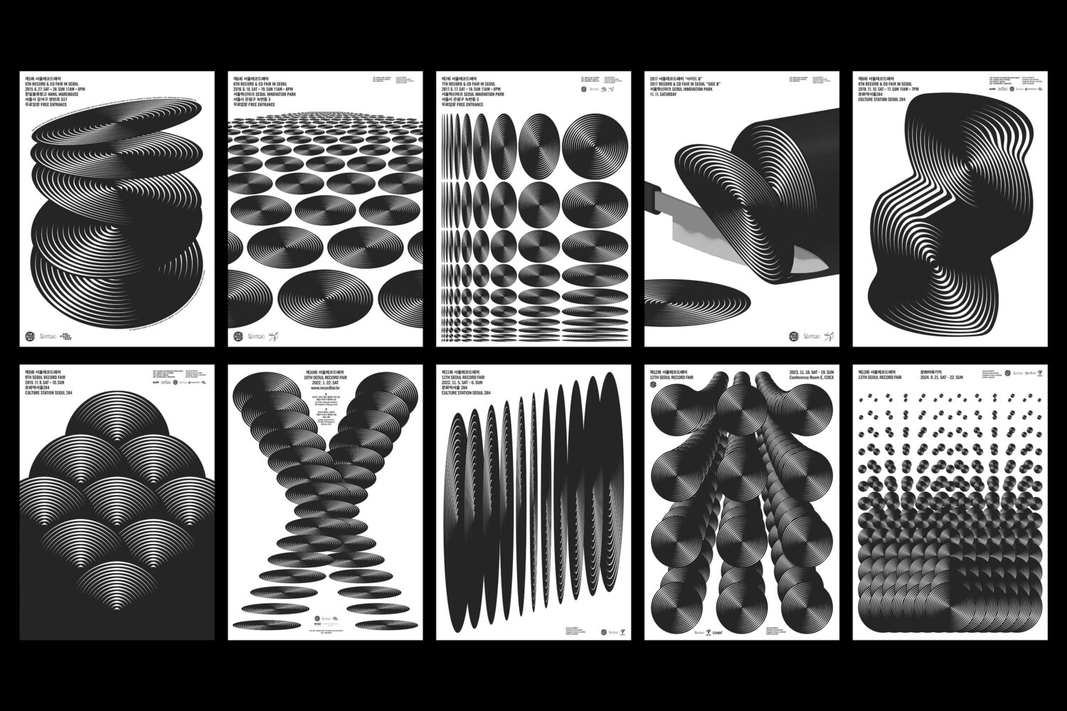
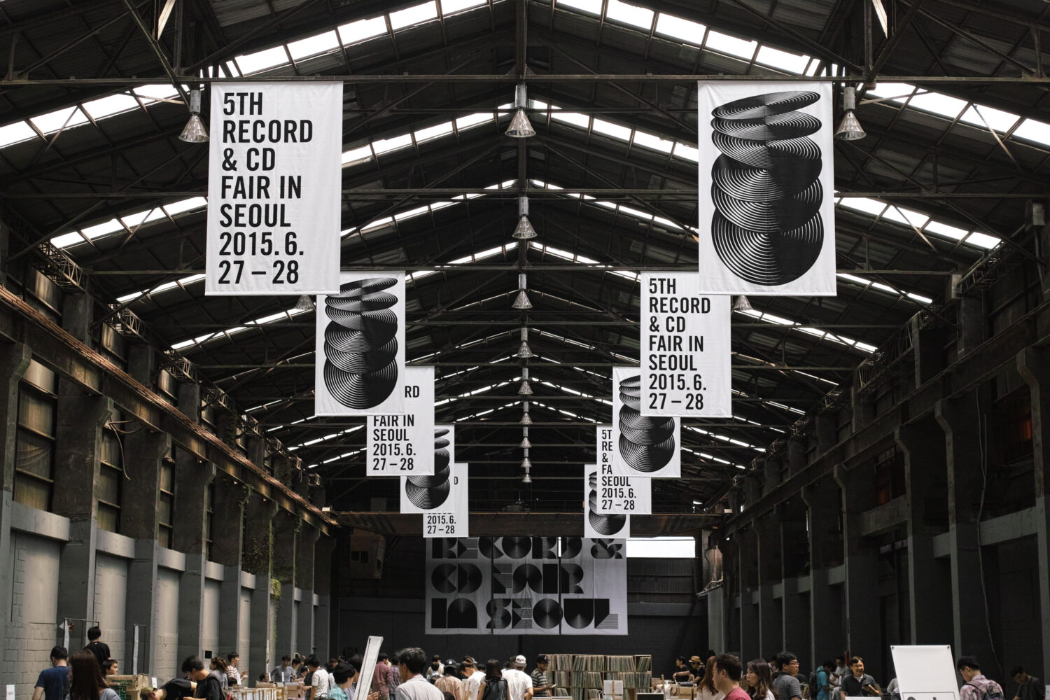
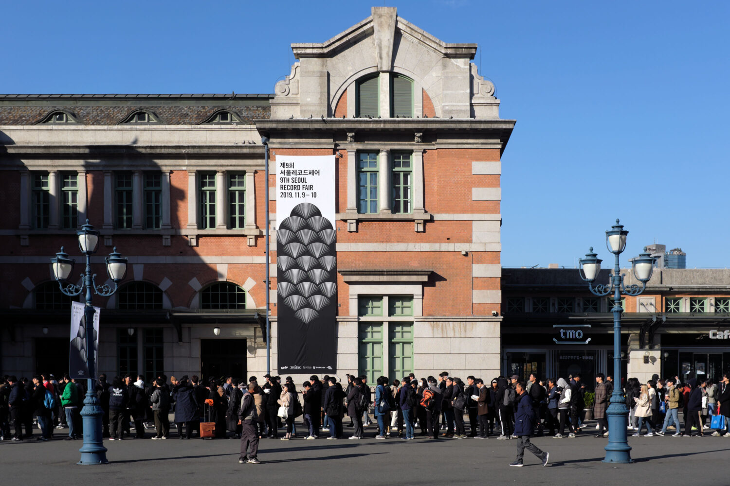
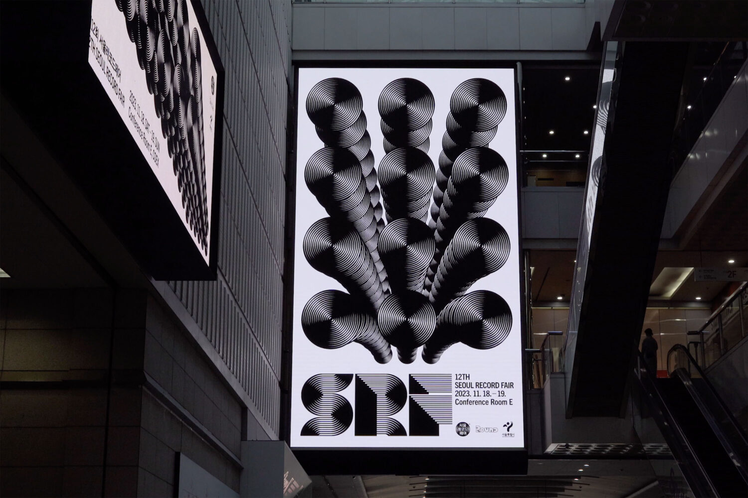
As the art director for the Seoul Record Fair for over a decade, my role was to shape its entire visual language. Unlike many events that create a new visual theme each year, my approach was rooted in the belief that consistency builds strength. I wanted to create an identity that would become more powerful with each iteration, rather than being disposable.
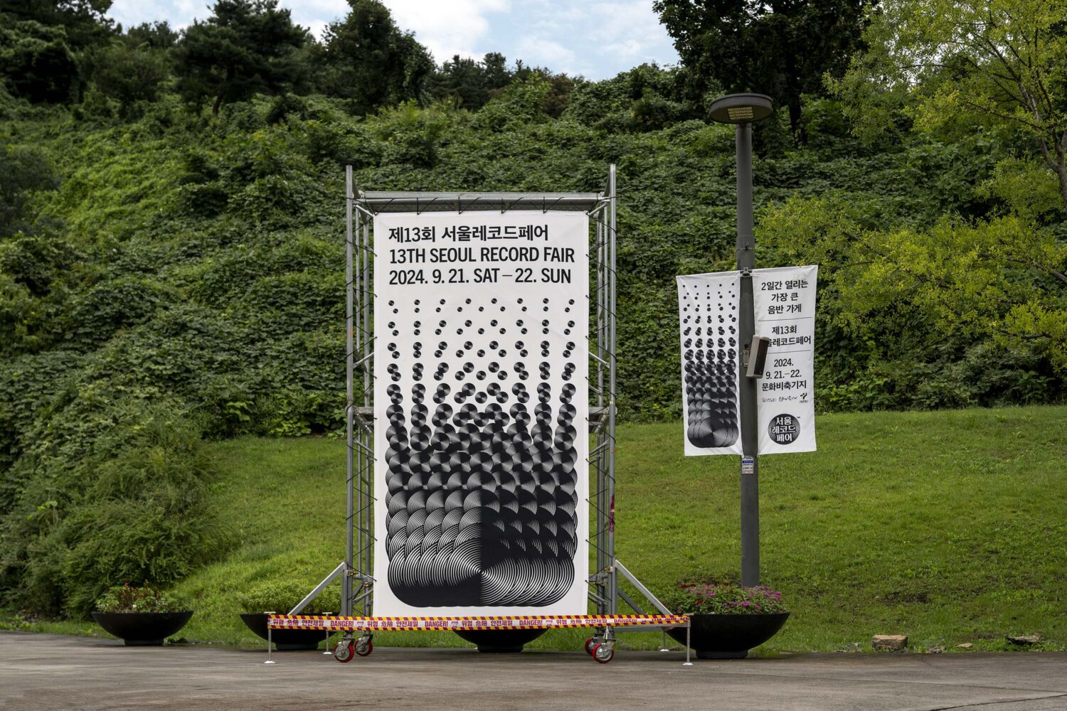
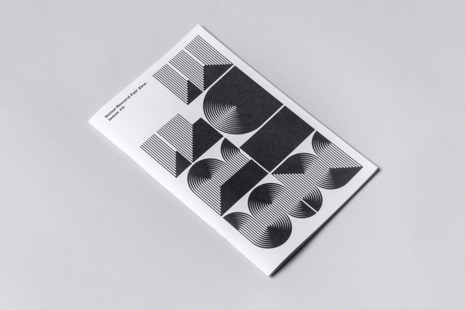
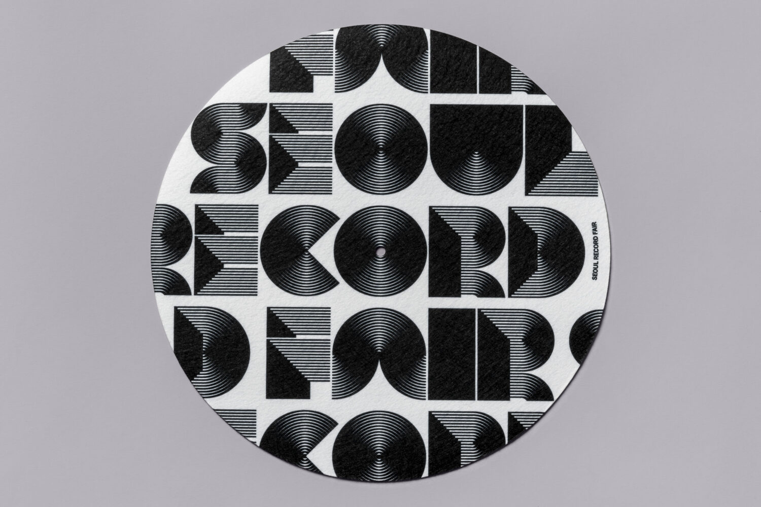
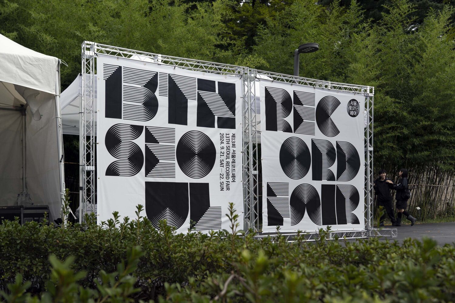
The solution was a design system built on a single, timeless motif: the solid black vinyl record. Enabled by the Fair’s independent spirit, this system became a creative playground. Each year, I used the simple circle motif as a canvas for formal experimentation, creating diverse variations that often included homages to the history of modern graphic design. This long-term strategy allowed me to build a powerful and recognizable brand.
Over time, the established identity evolved without losing its core. For instance, I introduced motion as a new dimension, animating graphics for digital applications. This evolution demonstrated the system’s inherent flexibility, proving it could adapt to new media while maintaining its signature look.
This project stands as a testament to a long-term vision, where consistency, not novelty, created an iconic cultural brand.
Credits
Jaemin Lee, Art direction and design
Sojeong Park, Motion design
Ajeong Kim, Motion design