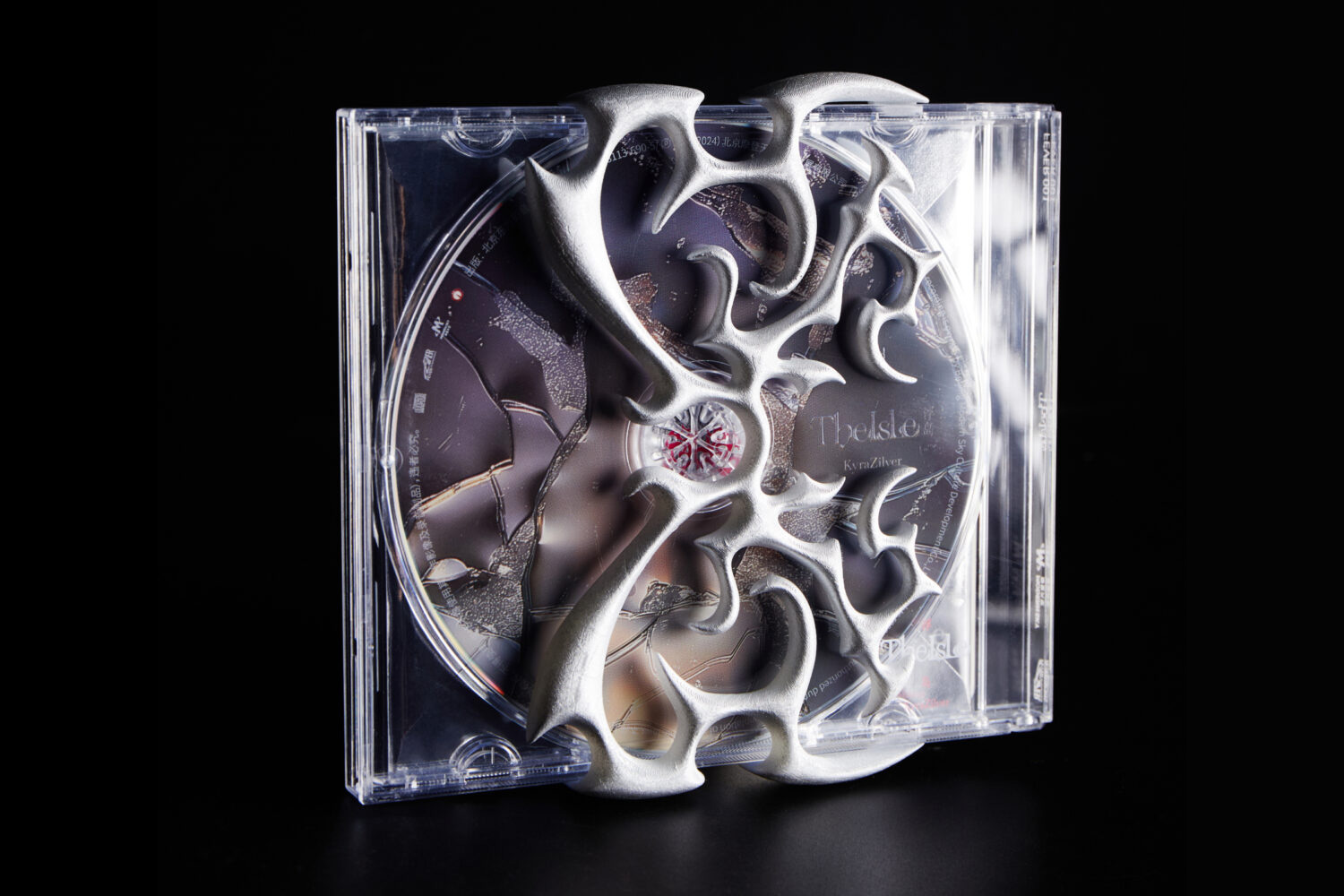
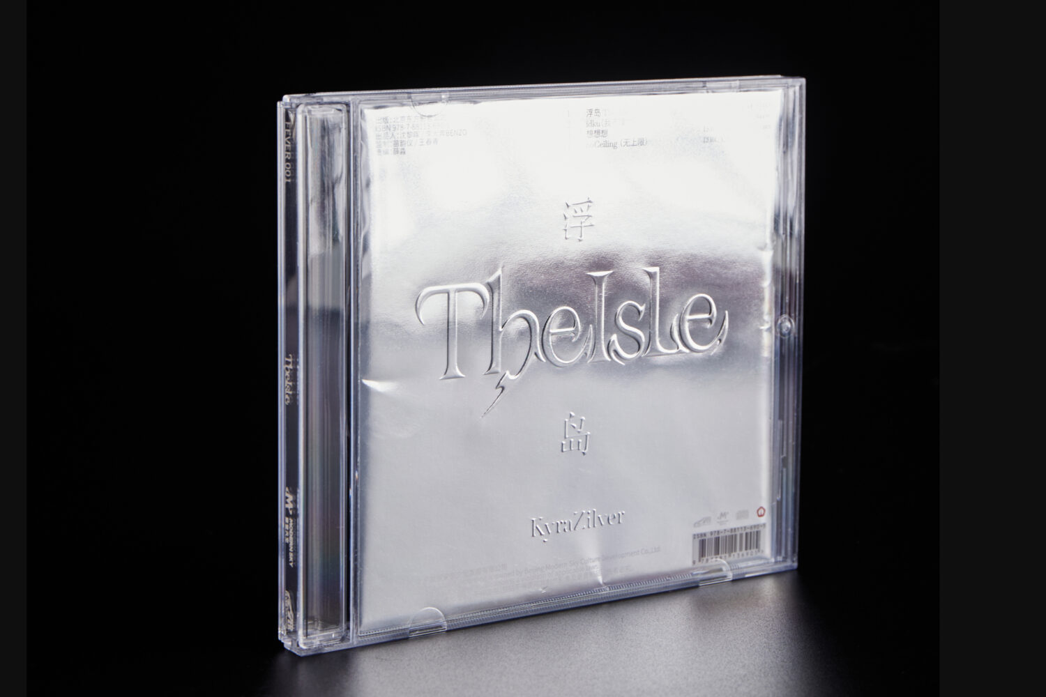
Album design inspired by The Isle, a song that explores the blurred boundary between dreams and reality. To reflect this concept, the album packaging subverts traditional formats—the CD is installed in reverse, echoing how dreams often invert reality.
Project Summary
Project Information
The design of this album is inspired by The Isle, a song that explores the blurred boundary between dreams and reality. To reflect this concept, the album packaging subverts traditional formats—the CD is installed in reverse, echoing how dreams often invert reality.
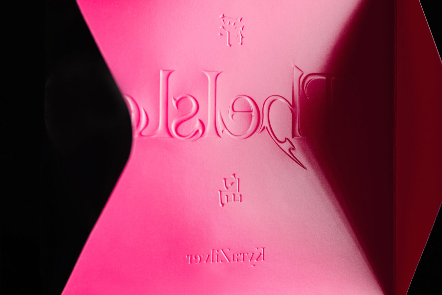
Like the music itself, the design is built on a stream-of-consciousness structure—fragmented, overlapping, and prismatic—mirroring the emotional and perceptual layers that shape our inner world.
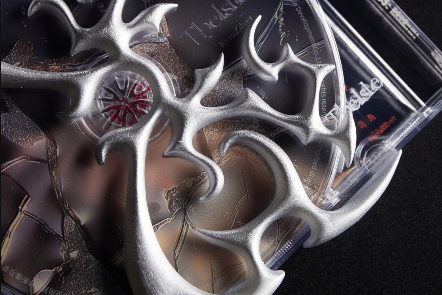
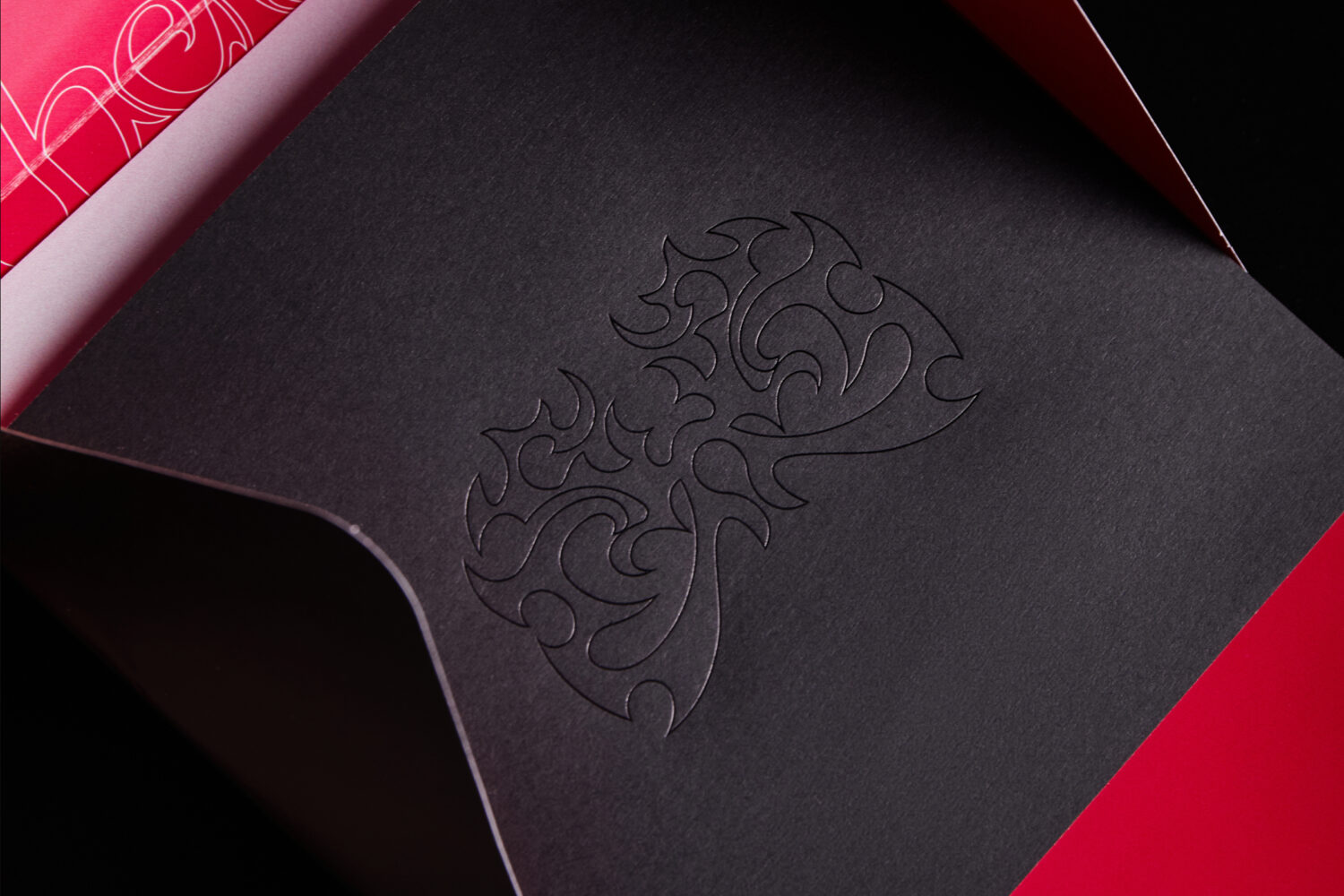
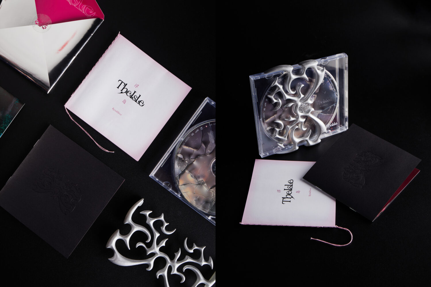
The 3D shell continues this narrative. Viewed from the front, it resembles an island; from the back, it transforms into a goat-horn totem. More than just packaging, the shell can also be worn as a mask—serving as a visual prop that blurs the line between the listener and the dreamscape.
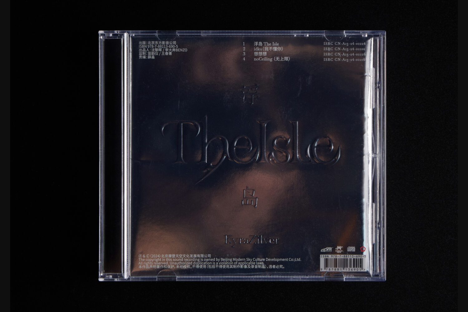
The CD is presented as a broken mirror, while its envelope is made from silver mirror board—fully reflective, encouraging the viewer to “enter” the illusion, as one might step into a dream through a mirror.
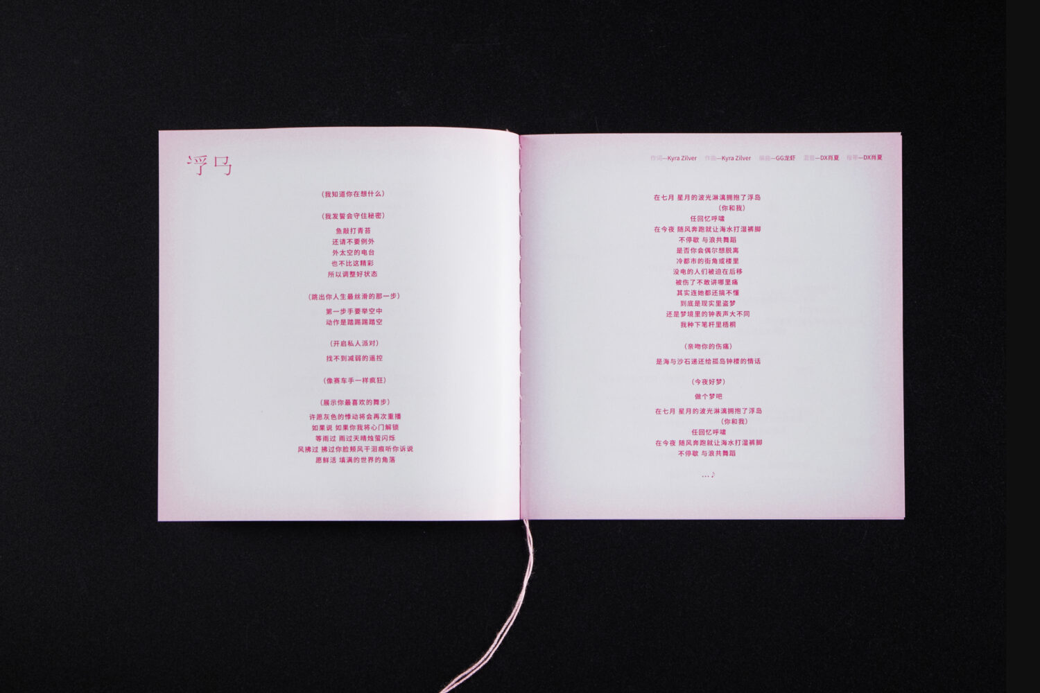
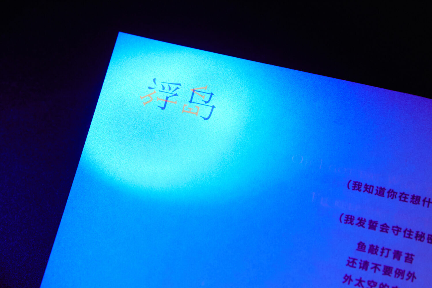
Inside the envelope lies a folded set of visual materials: a poster, lyrics book, and photo album. The lyrics alternate between Chinese and English, symbolizing day and night, consciousness and dream. The English text is printed in fluorescent ink, only visible under UV light—revealing itself only in the dark.
This multi-sensory, symbolic design offers a physical journey through the album’s conceptual world—a dream made tangible.
Credits
Yifeng Xie, Art direction & Graphic Design
Weijie Guo, Art direction & Graphic Design