PoMo is a new modern and contemporary art museum in Trondheim. We developed a flexible identity system, campaign, website, and editorial materials that reflect the museum’s values of openness and inclusivity.
Project Summary
Project Information
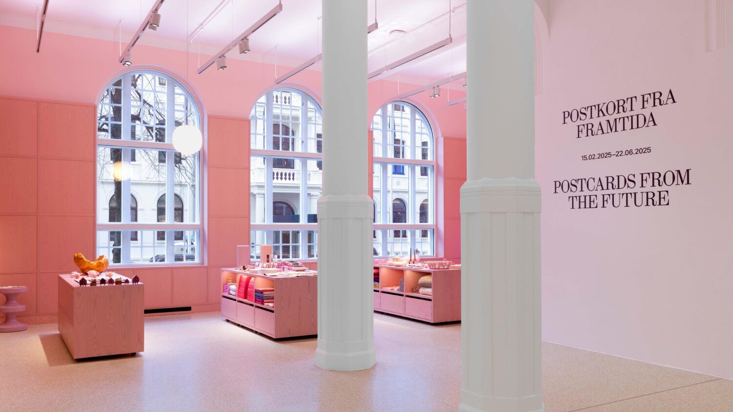
PoMo is a new museum for modern and contemporary art located in Trondheim, Norway. It is housed in a 1911 Art Nouveau building by architect Karl Norum (1852–1911), which once served as the city’s post office. The museum aims to make contemporary art accessible to everyone, regardless of background or experience.
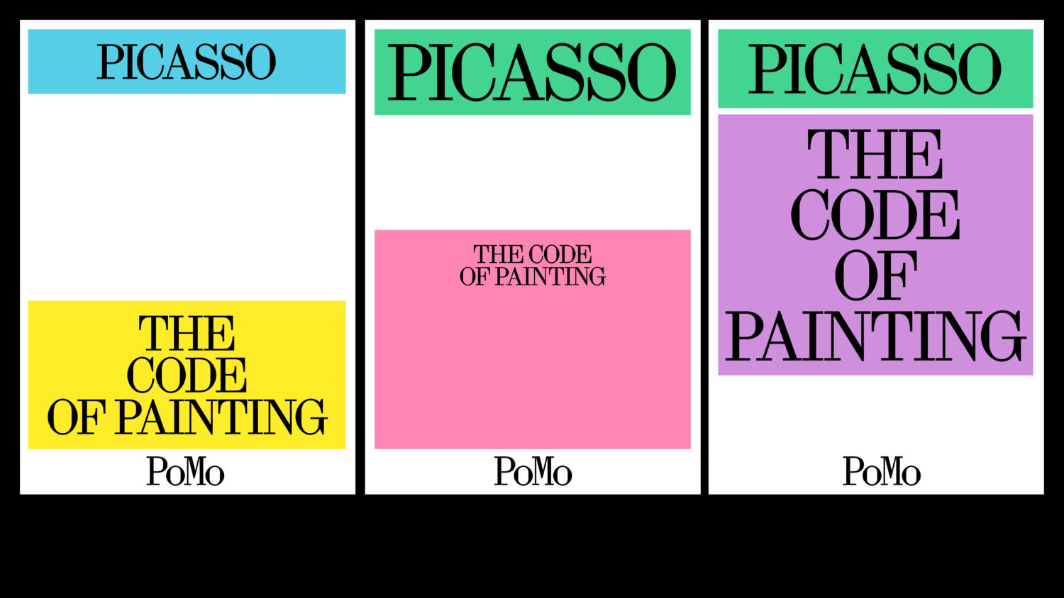
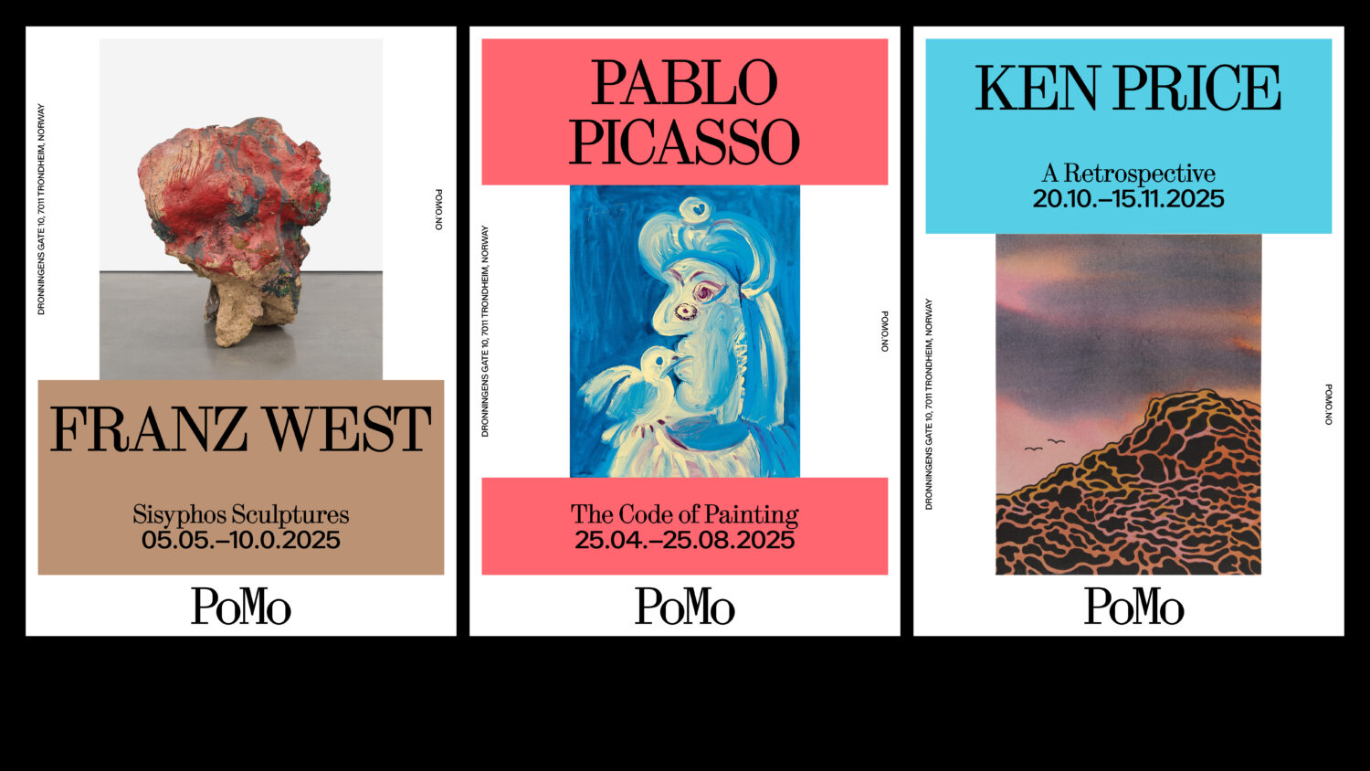
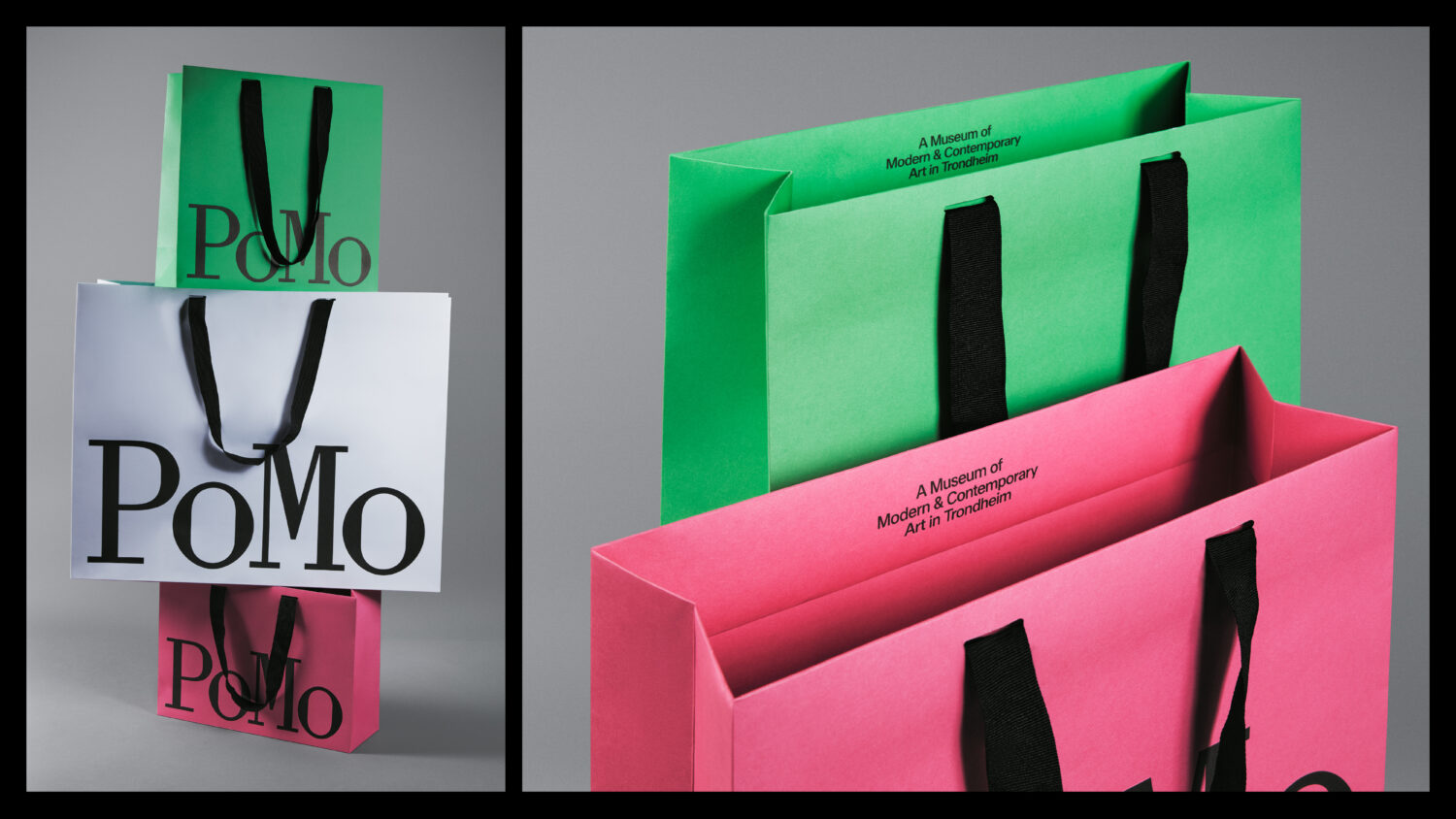
We created a flexible visual identity to reflect this inclusive mission. The museum’s original name, Posten Moderne, was shortened to PoMo—a more adaptable name suited to both physical and digital formats. This move aligns with naming conventions in the cultural sector. Instead of following the typical use of sans-serif logos, the logotype uses Synt Mono, a serif with a historical feel that references the building’s past. For the broader system, we combined Synt with Walter Neue to bring in a softer and more contemporary tone. Both typefaces are by ABC Dinamo. The colour palette draws from the building’s new interior by Erik Langdalen and India Mahdavi, reflecting the museum’s interest in a colourful and optimistic expression.
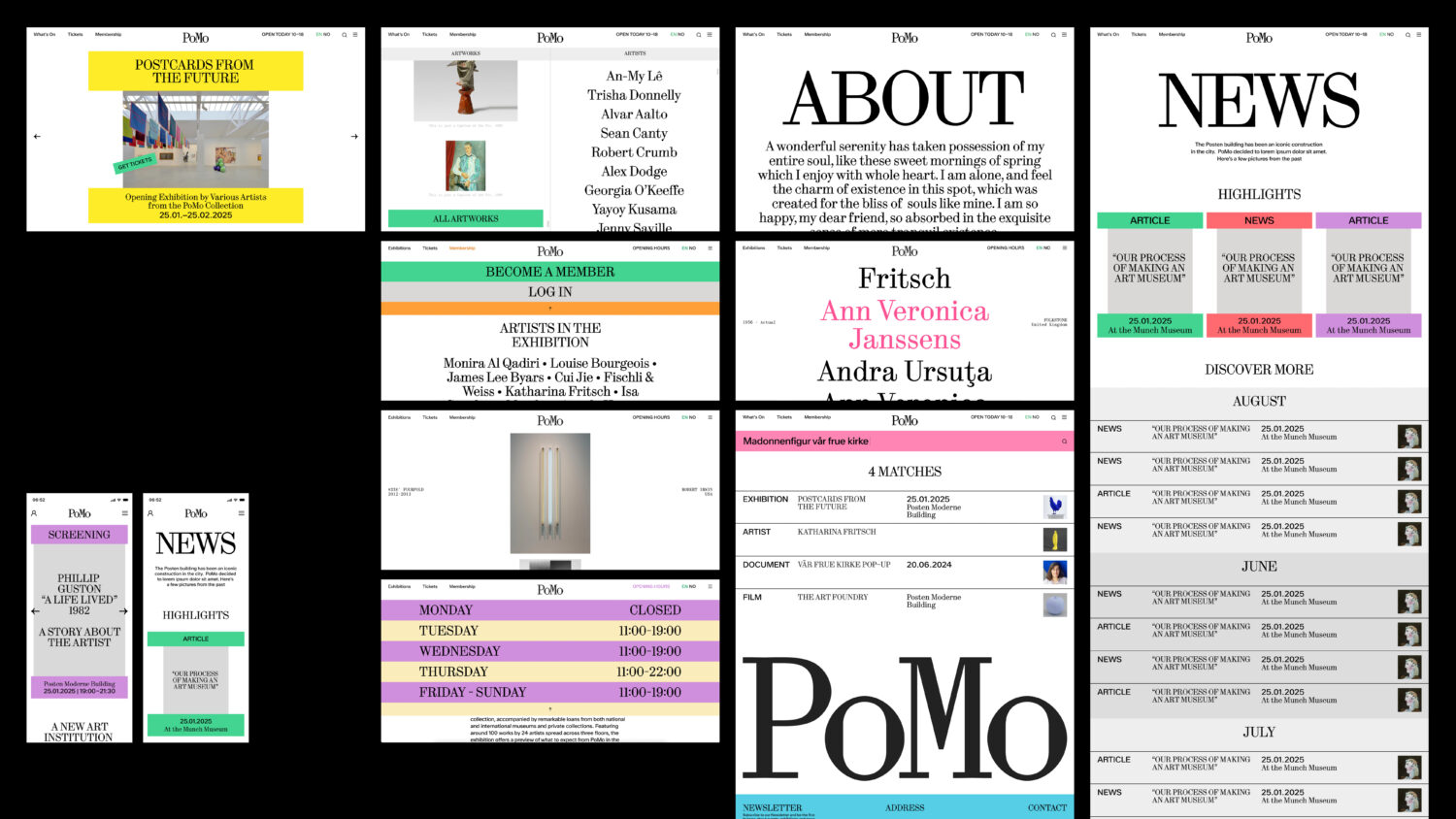
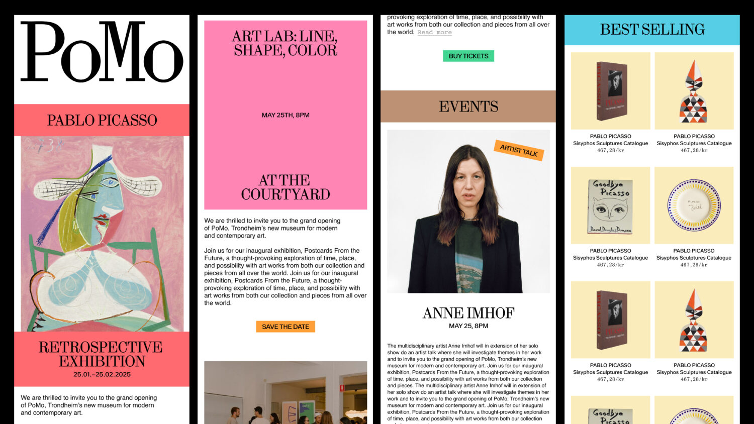
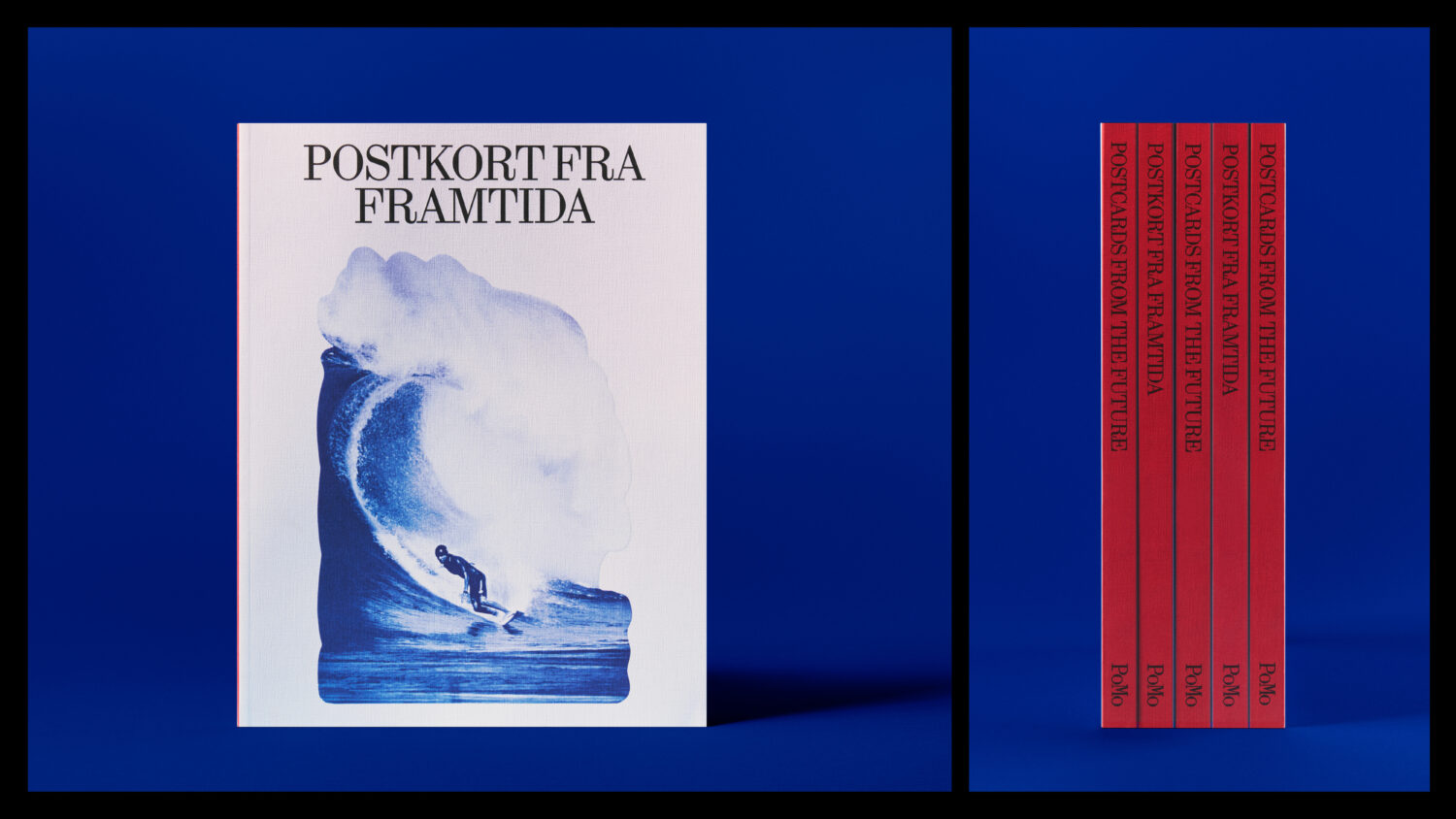
The identity system is modular and responsive. It plays with the idea of opening—visually and conceptually—through rectangular frames that expand across formats. This structure appears in the animated logotype, the website layout, and various content containers. The system has been applied across signage, digital templates, merchandise, and printed matter.
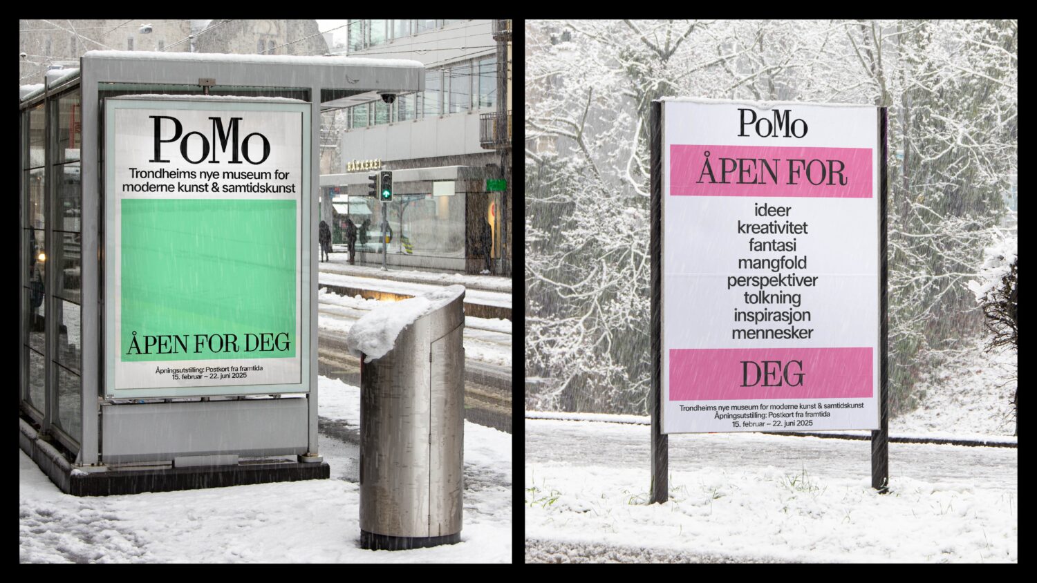
To mark the museum’s opening in February 2025, we created a campaign around the theme “Open,” shown across Trondheim Airport, bus stops, billboards, and social media. It reinforced both the physical opening and the museum’s core values—open to people, ideas, creativity, and difference.
The website brings the identity into a clear and functional digital format. It is easy to navigate while giving space to visual and editorial content. The identity is built to be flexible, accessible, and lasting.
Credits
Clase bcn, Design team
PoMo Trondheim, Client