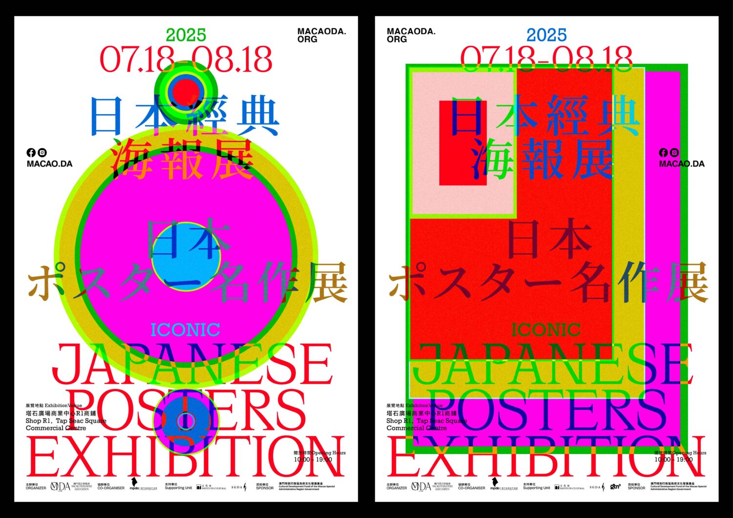
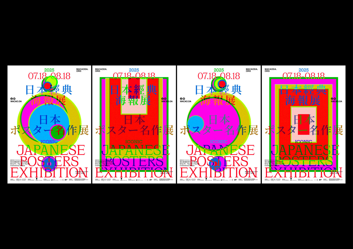
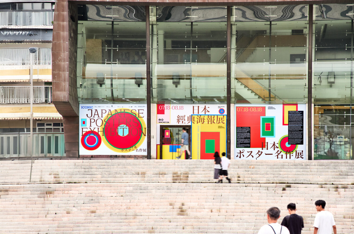
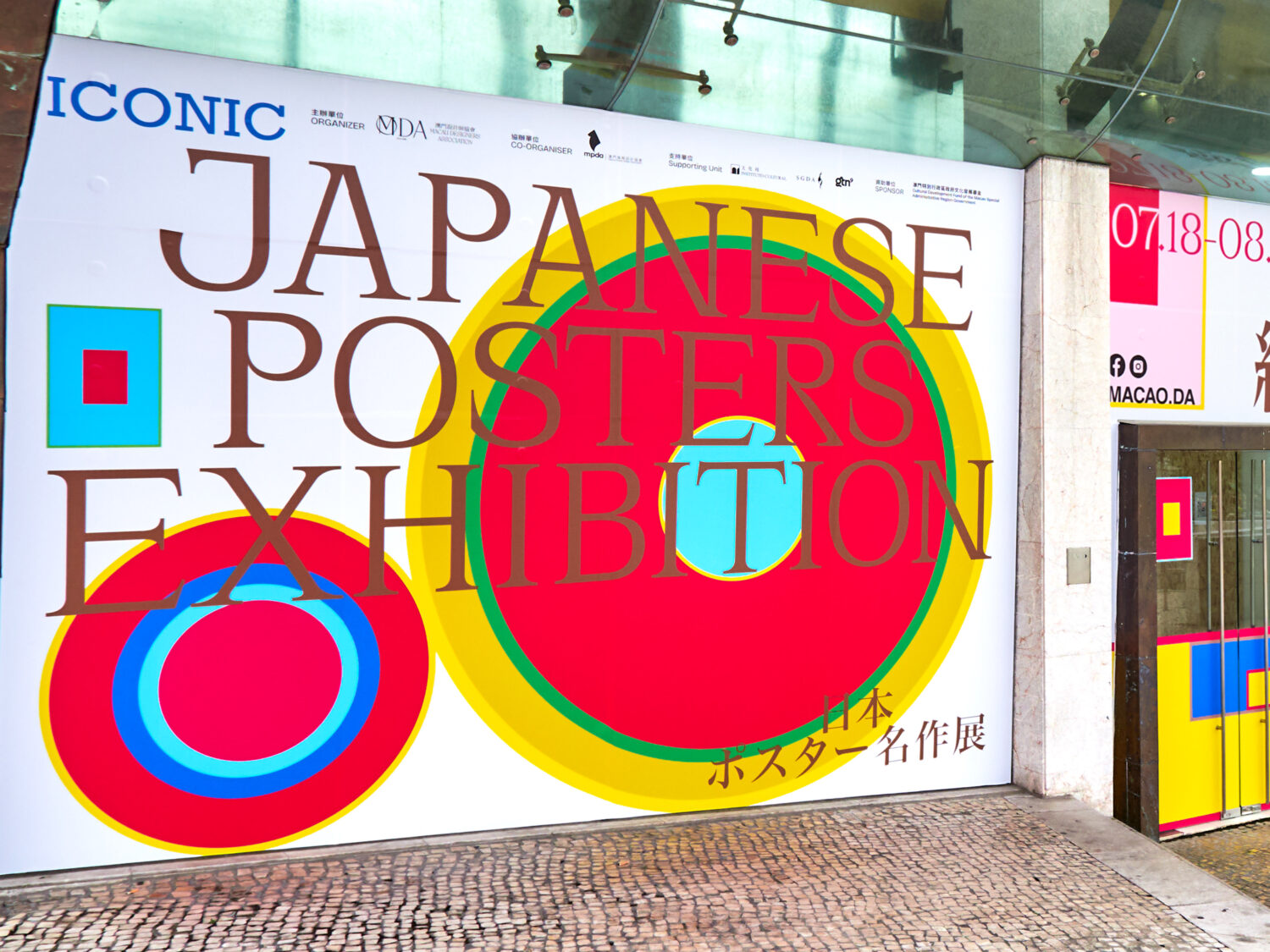
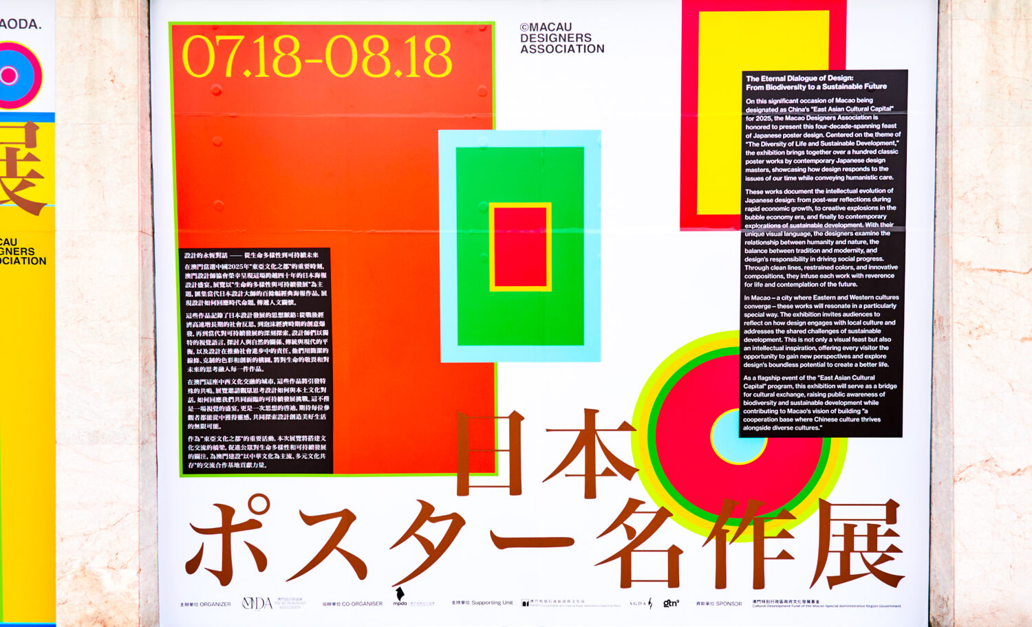
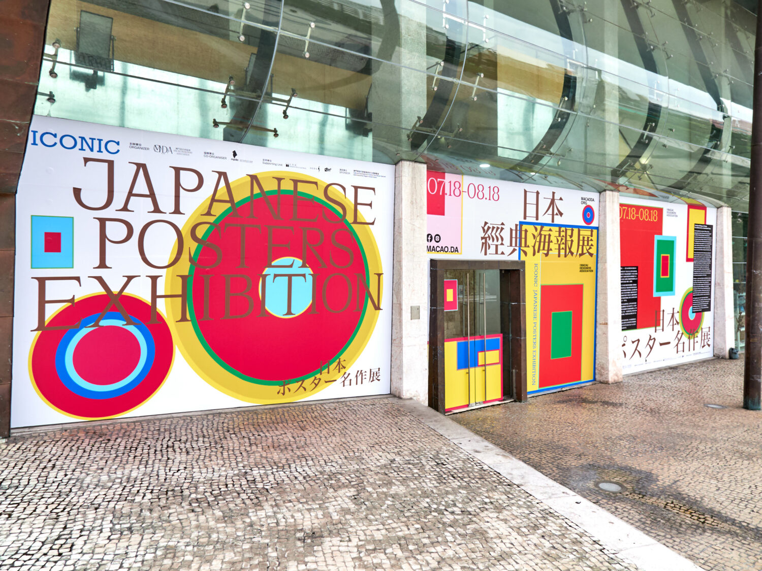
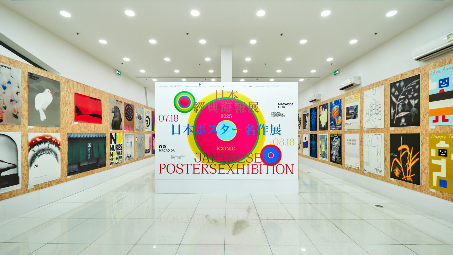
The Iconic Japanese Posters Exhibition visuals reimagine stacked and rolled posters through a dynamic top-down perspective, translating physical forms into vibrant graphic language. Color blocks act as “unloaded folders”—each hue representing a distinct era (post-war austerity, bubble-era exuberance, modern sustainability)—while harmonizing into a cohesive whole. This layered approach mirrors Japanese design’s enduring dialogue between tradition and innovation, embodying the exhibition’s theme of Diversity of Life and Sustainable Development. Like intertwined roots, elements coexist without competition, reflecting design’s evolving response to societal change while maintaining humanistic depth. The result is a visual metaphor for resilience—honoring heritage while persistently growing toward new futures.
The Iconic Japanese Posters Exhibition posters reimagine the physicality of stacked and rolled posters through a top-down perspective, translating their forms into dynamic visual language. This approach mirrors the exhibition’s core theme—The Diversity of Life and Sustainable Development—by symbolizing how Japanese design, across generations, responds to societal shifts while retaining humanistic depth.
Rather than reducing the exhibition to a single stylistic homage, we employed color blocks as a conceptual framework: they appear as “unloaded folders,” their deceptively simple surfaces hinting at layered design legacies. Each hue embodies a distinct era or vision—post-war introspection, bubble-era exuberance, or contemporary sustainability—yet harmonizes within the composition. Like the roots of Japanese design culture, these blocks intertwine without obscuring one another, much like the roots of Japanese design culture—deeply grounded in tradition yet continually sprouting new possibilities, embedding reverence for life and reflections on the future into the work.
Untitled Macao, Design Firm
Au Chon Hin, Creative Director