holding, (shift)ing visualises invisible, gendered labour through a tablecloth made from seven aprons. Sewing, embroidery, and childhood drawings reclaim care as feminist practice. An accompanying archive and translucent flyer reveal the hidden processes that hold everything together — exploring visibility, responsibility, and the structural weight of the invisible.
Project Summary
Project Information
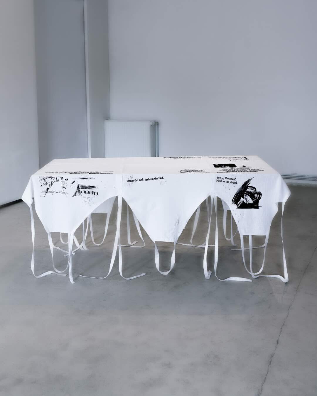
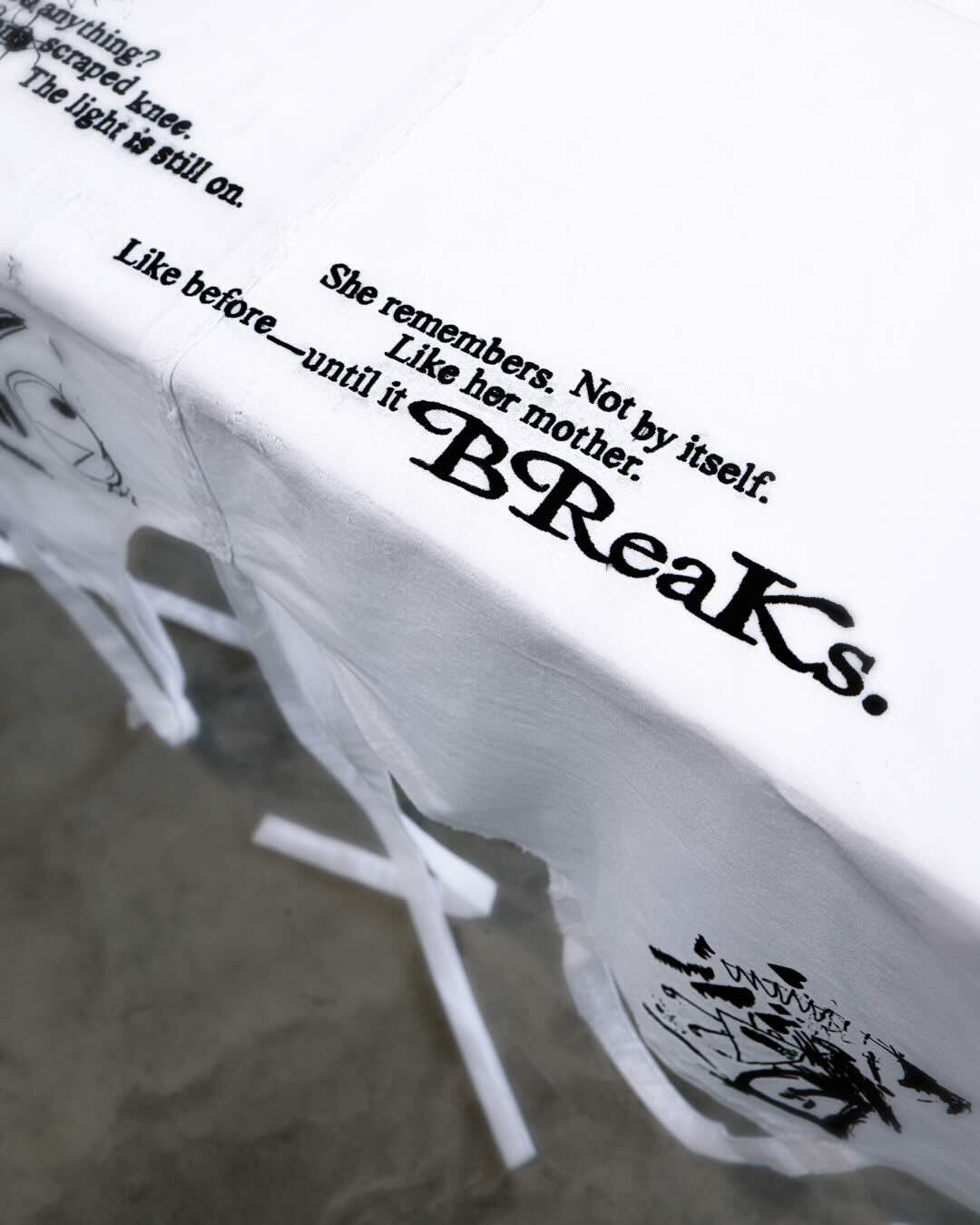
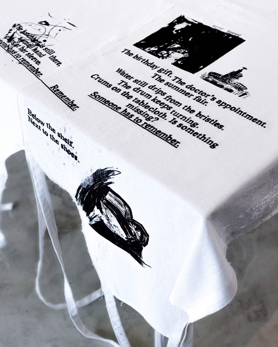
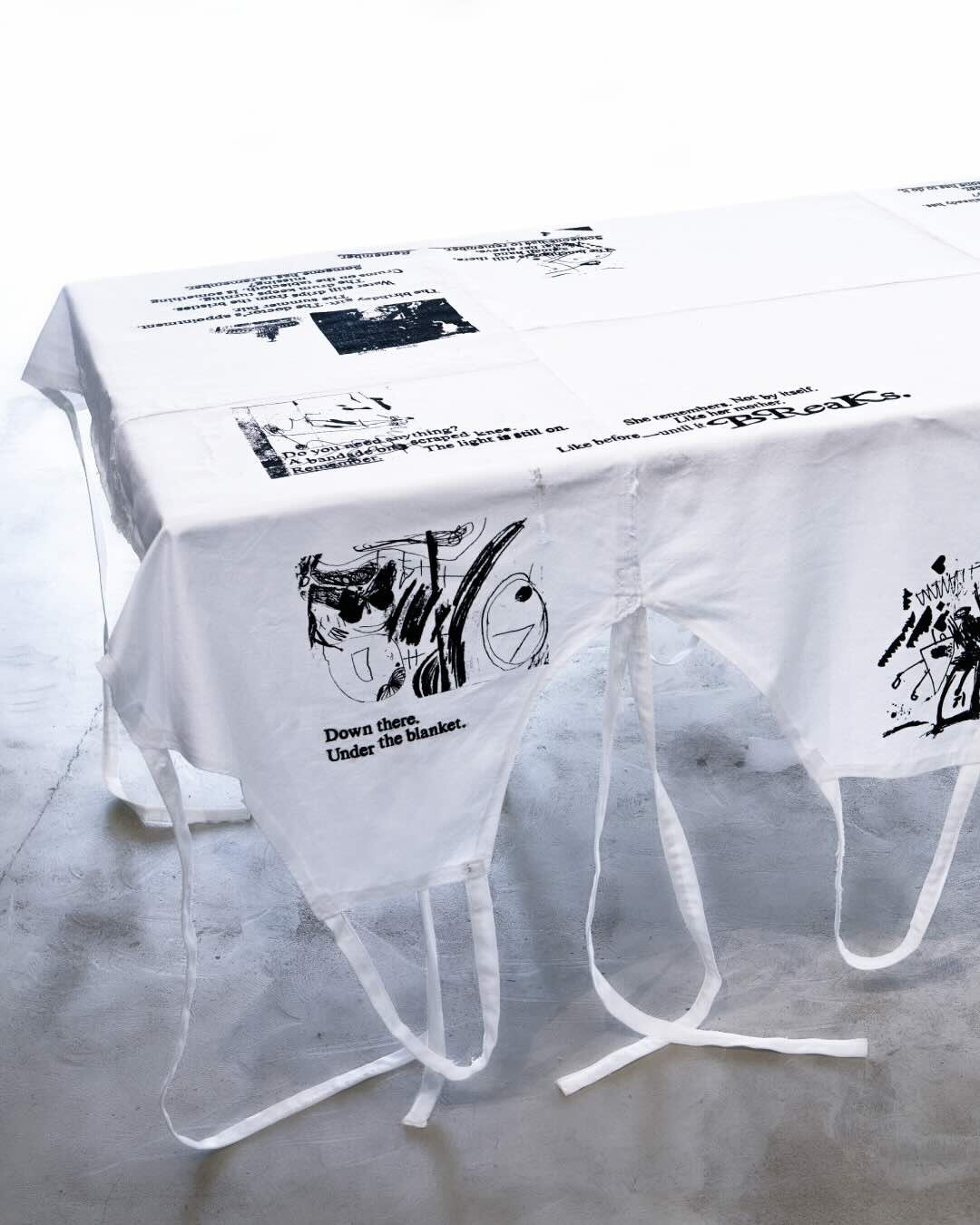
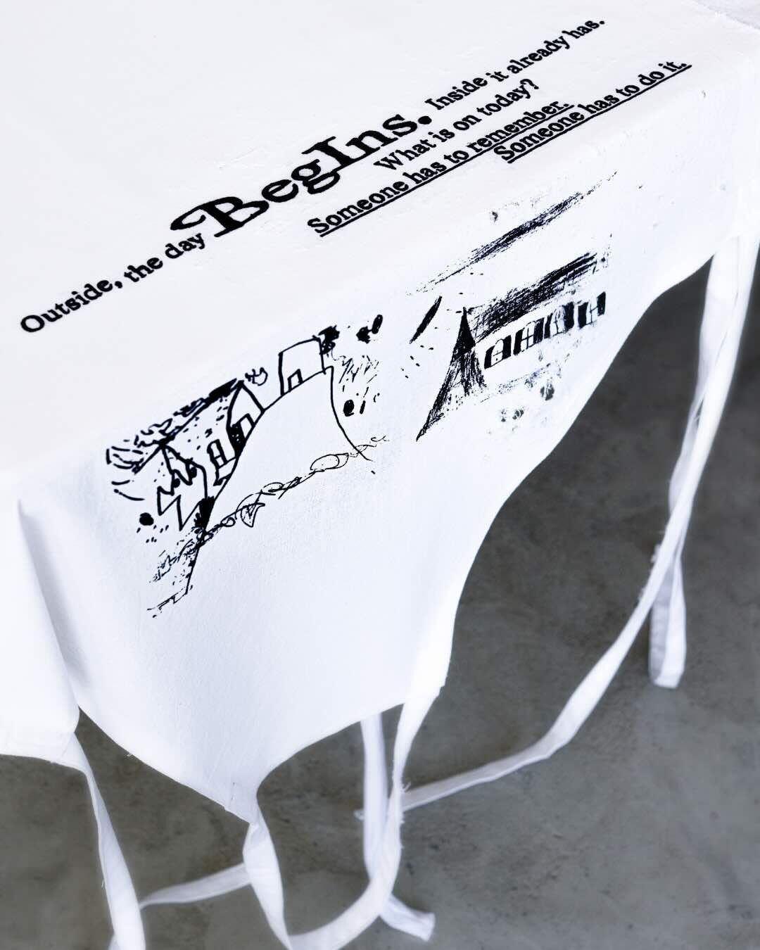
holding, (shift)ing brings invisible, gendered labour to the table — the kind that holds everyday life together: care work, mental load, and domestic tasks. At the centre of the installation lies a large tablecloth made from seven white aprons. Sewn from linen and cotton, these aprons are embroidered with a cyclical poem and printed with childhood drawings. They do not merely decorate the table — they carry it. By reappropriating sewing and embroidery as feminist strategies, and reclaiming the apron as both symbol and structure, the work opens up space for reflection on care, responsibility, and social roles.
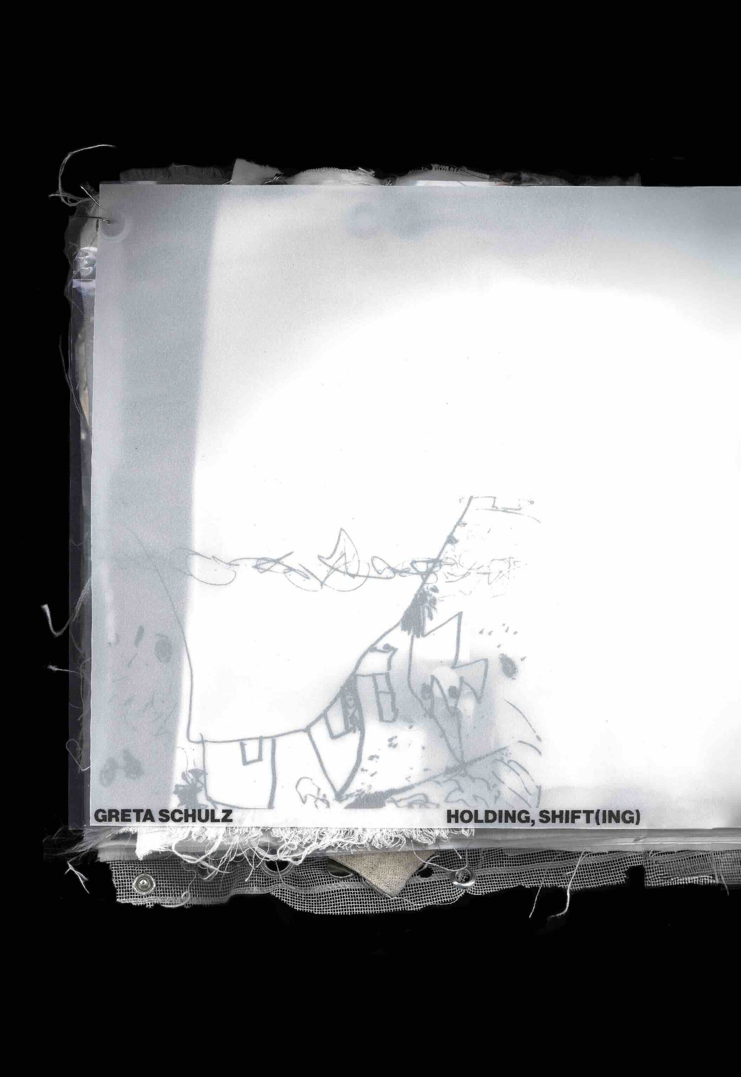
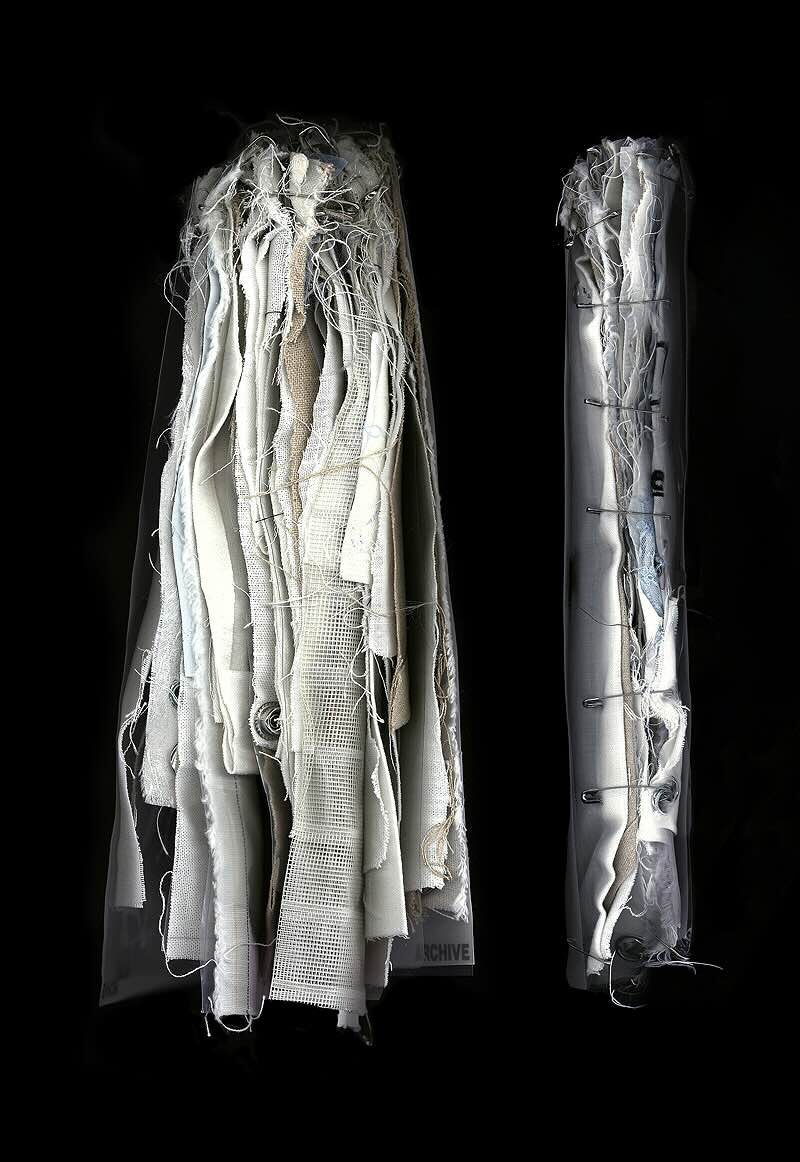
Accompanying the tablecloth is a process-based archive, which serves as a physical record of the labour behind the work. This book-like object reveals otherwise invisible parts of the creation process: textile tests, material remnants, and intermediate stages. It exclusively uses materials that were part of the making — fabrics, threads, eyelets, pins, and screen-printing foils. The archive’s cover lies loosely on top; it is held together by its inner layers. This structural choice is symbolic: what carries often remains hidden. Rather than functioning as supplementary material, the archive stands as an independent work of design and care.
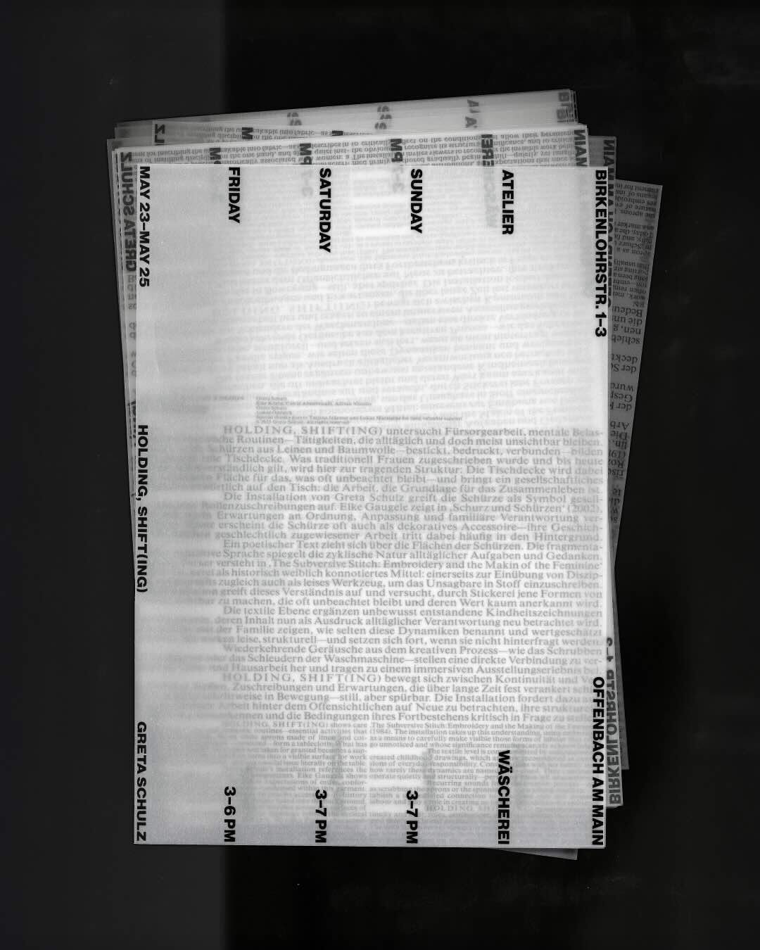
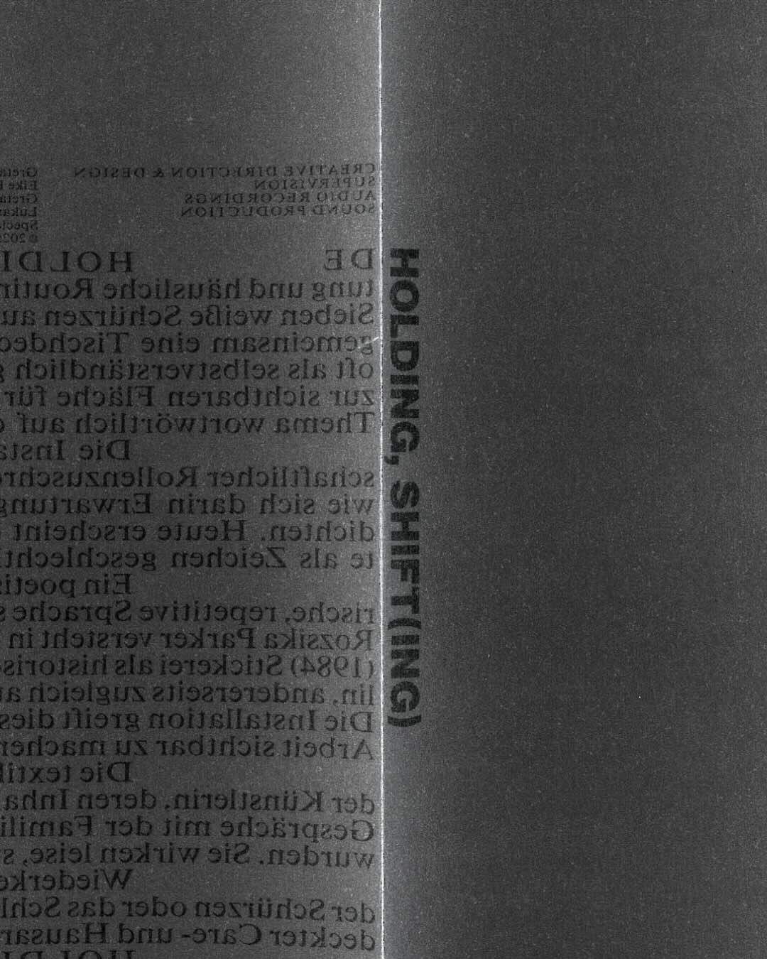
The flyer, printed on translucent paper, makes visibility and layering symbolically tangible. The title holding, (shift)ing is placed at the center — where the flyer is held — marking the act of “holding.” A rotation in reading direction mirrors the idea of “shifting.” When unfolded, the flyer reveals weight on the inside — like the kind of labour that remains unseen but supports everything. Rotated, it also functions as a poster. A delicate serif text block supports bold display type, forming a visual metaphor for the tension between the visible and the invisible.
Credits
Greta Schulz (Kongreta Studio), Art Direction, Concept, Design & Production