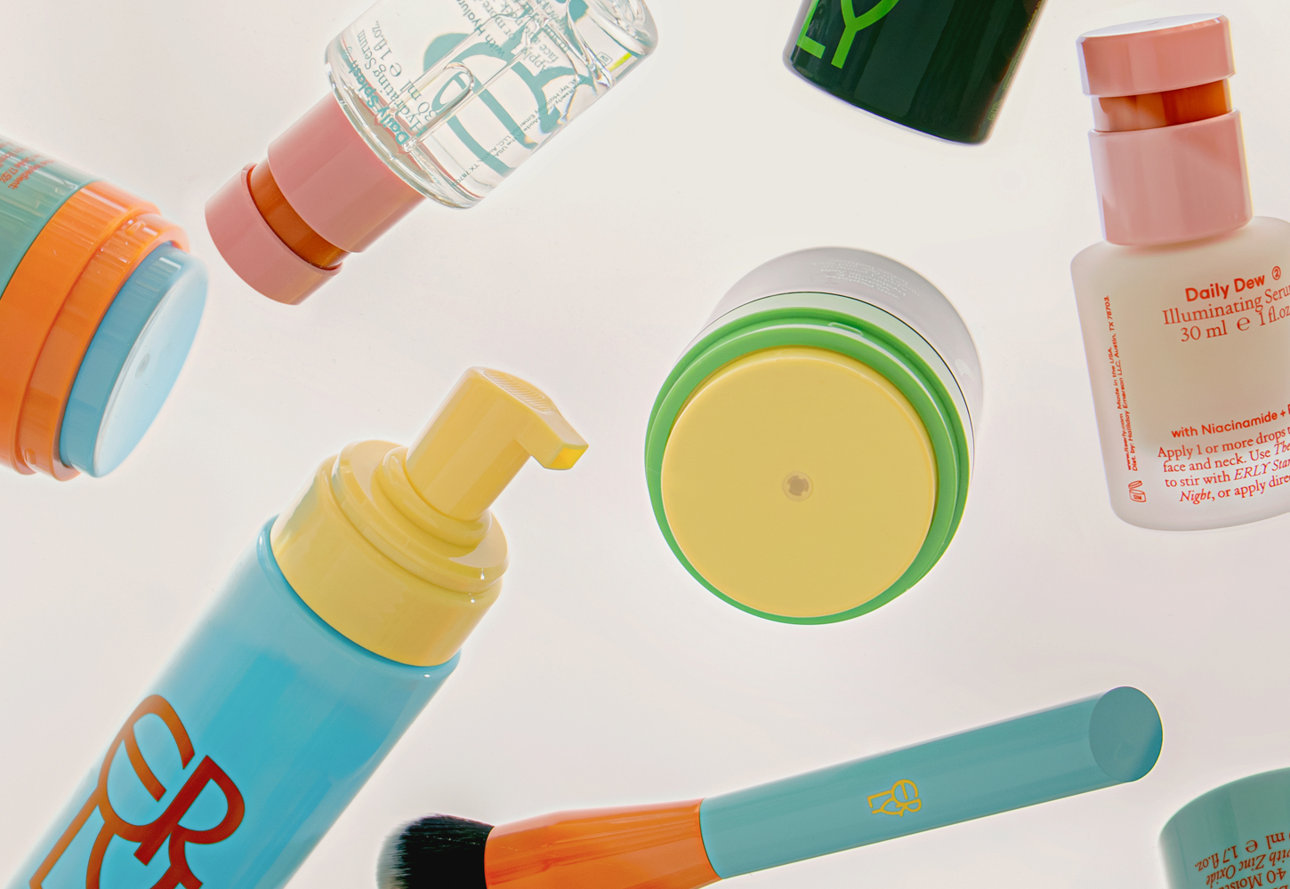
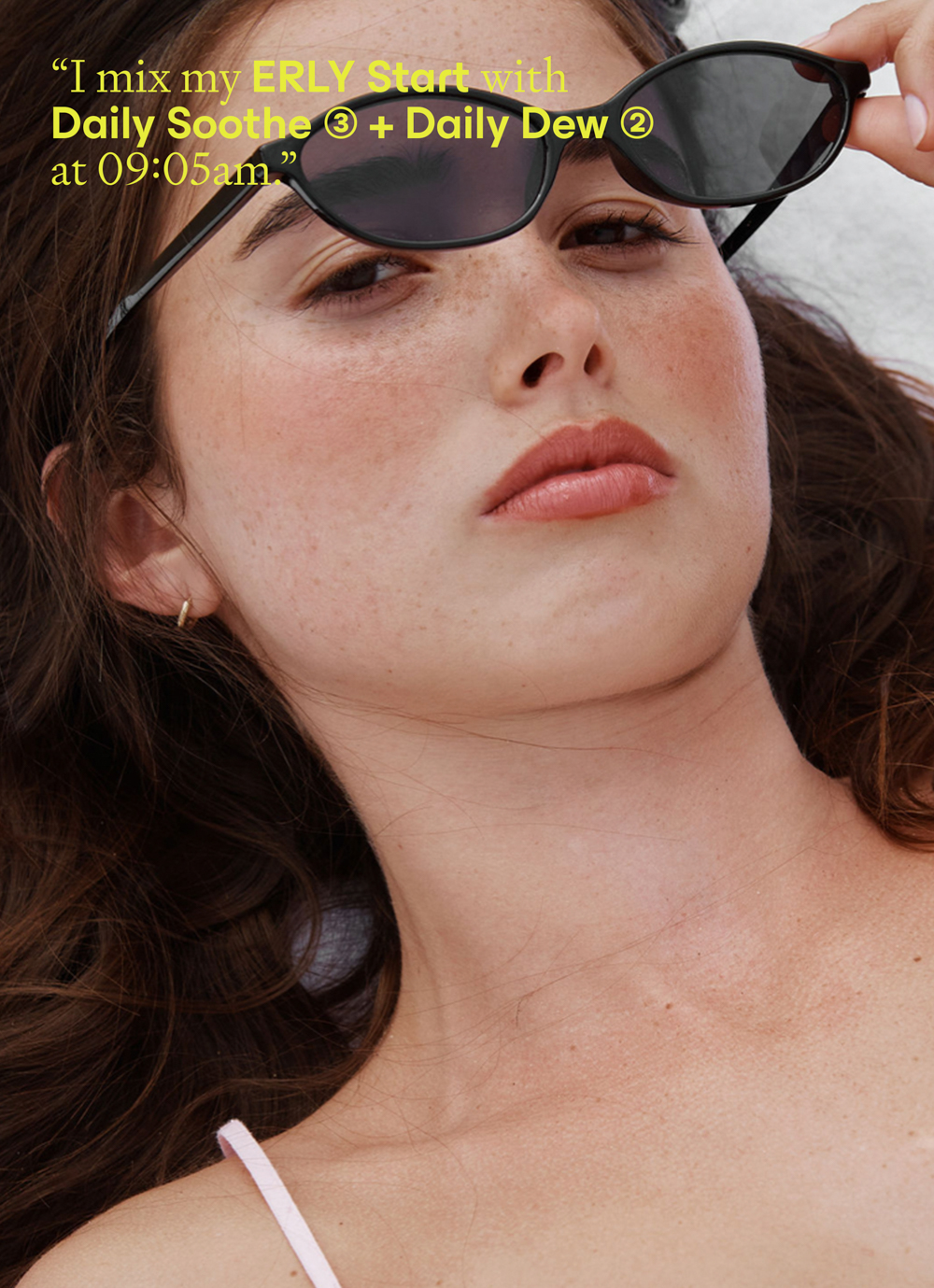
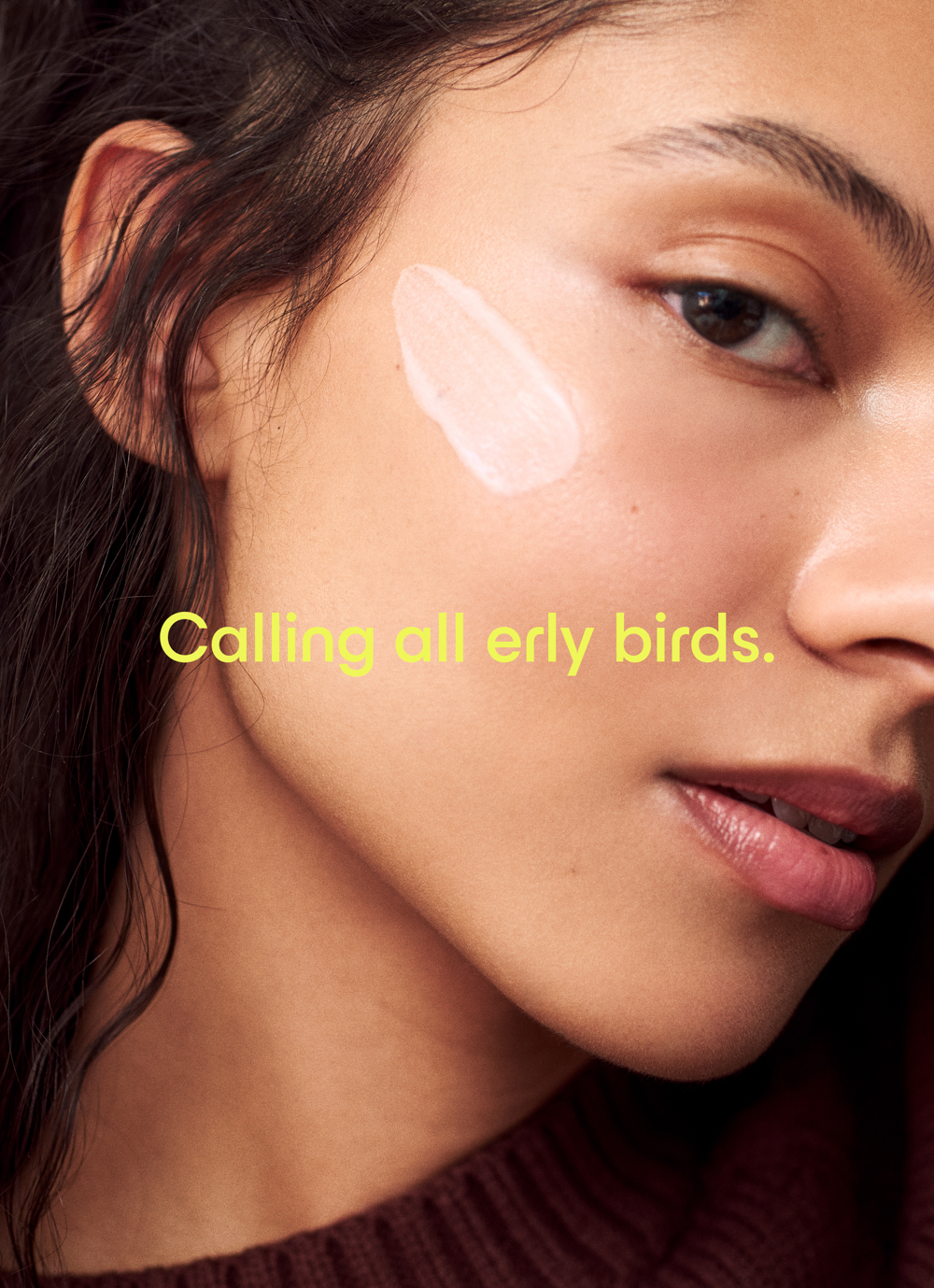
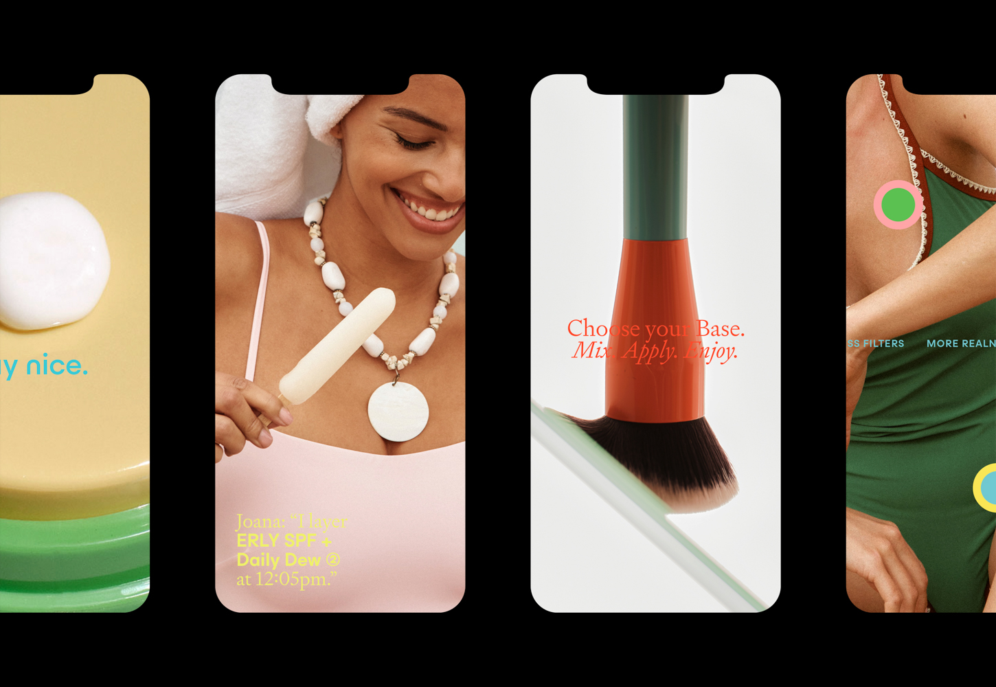
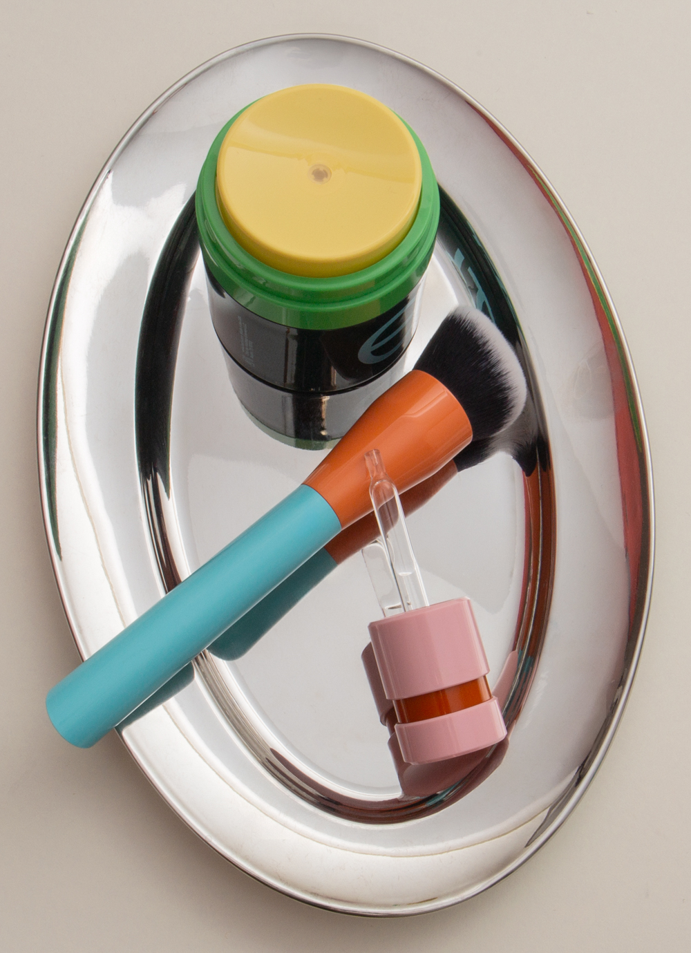
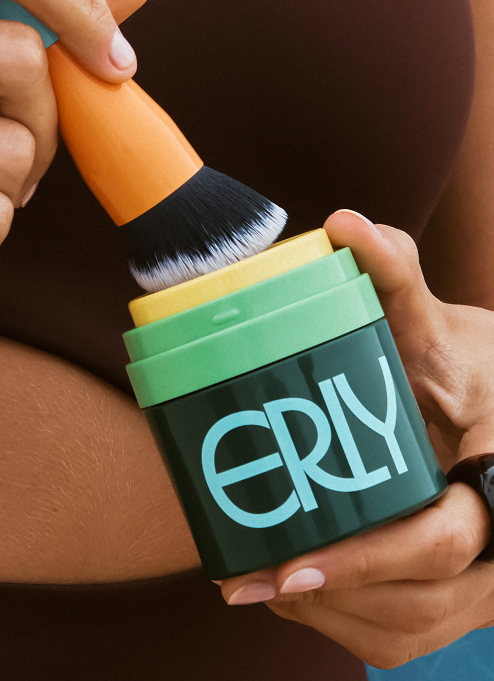
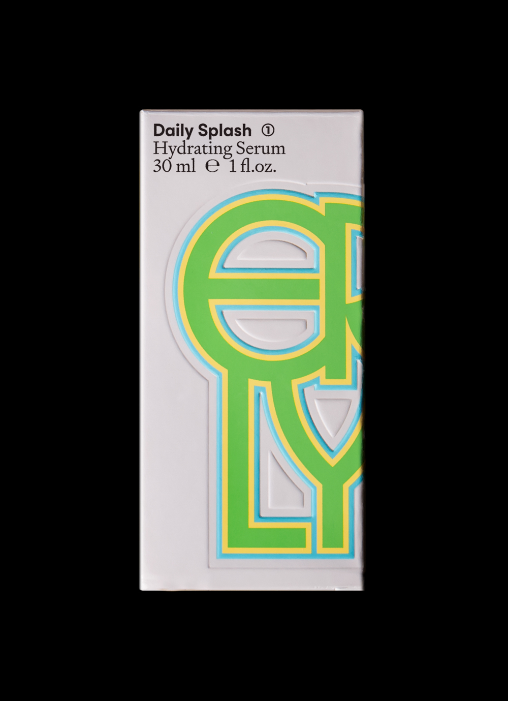
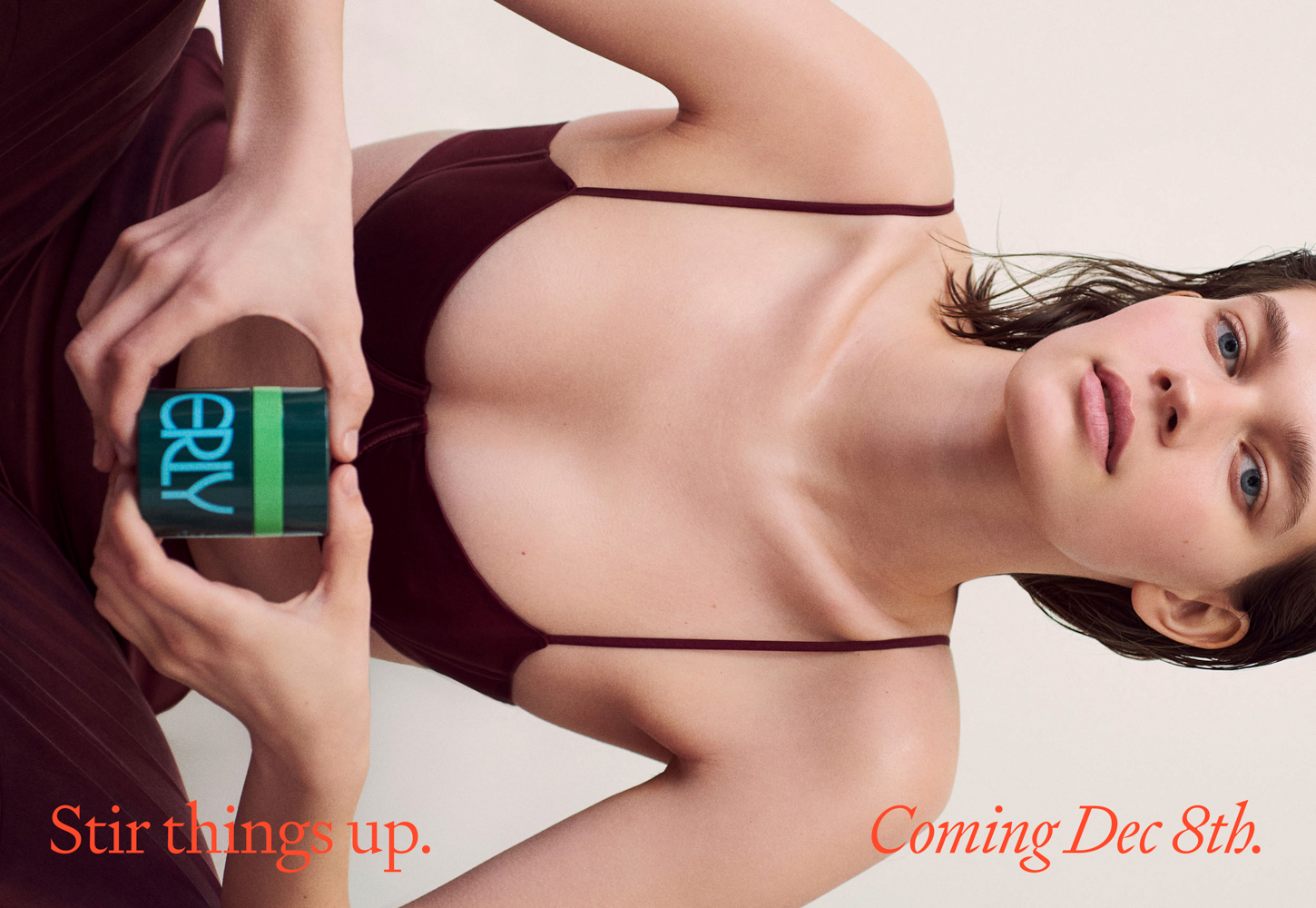
Erly is a clean skincare brand for all skin types, regardless of age. Inspired by and named after the founders’ daughters, it seeks to take care of your skin in a safe and age-appropriate way: gentle, effective, affordable formulas, that support skin from adolescence into adulthood, and help encourage healthy habits and daily care. With compounding and personalization at the brand’s core, the product line consists of essentials such as moisturizer, SPF and face wash, all customizable with a set of serums addressing different skincare issues.
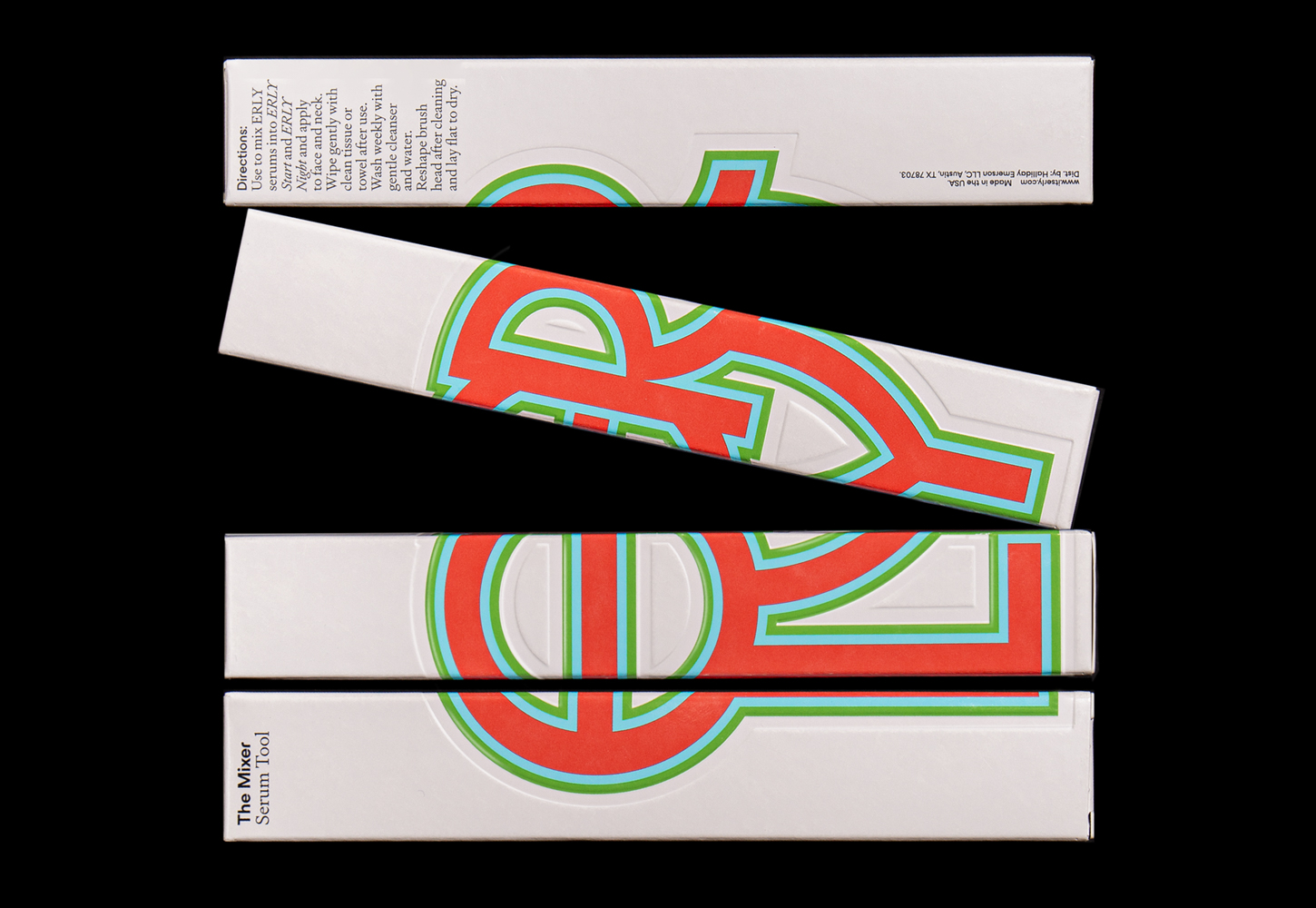
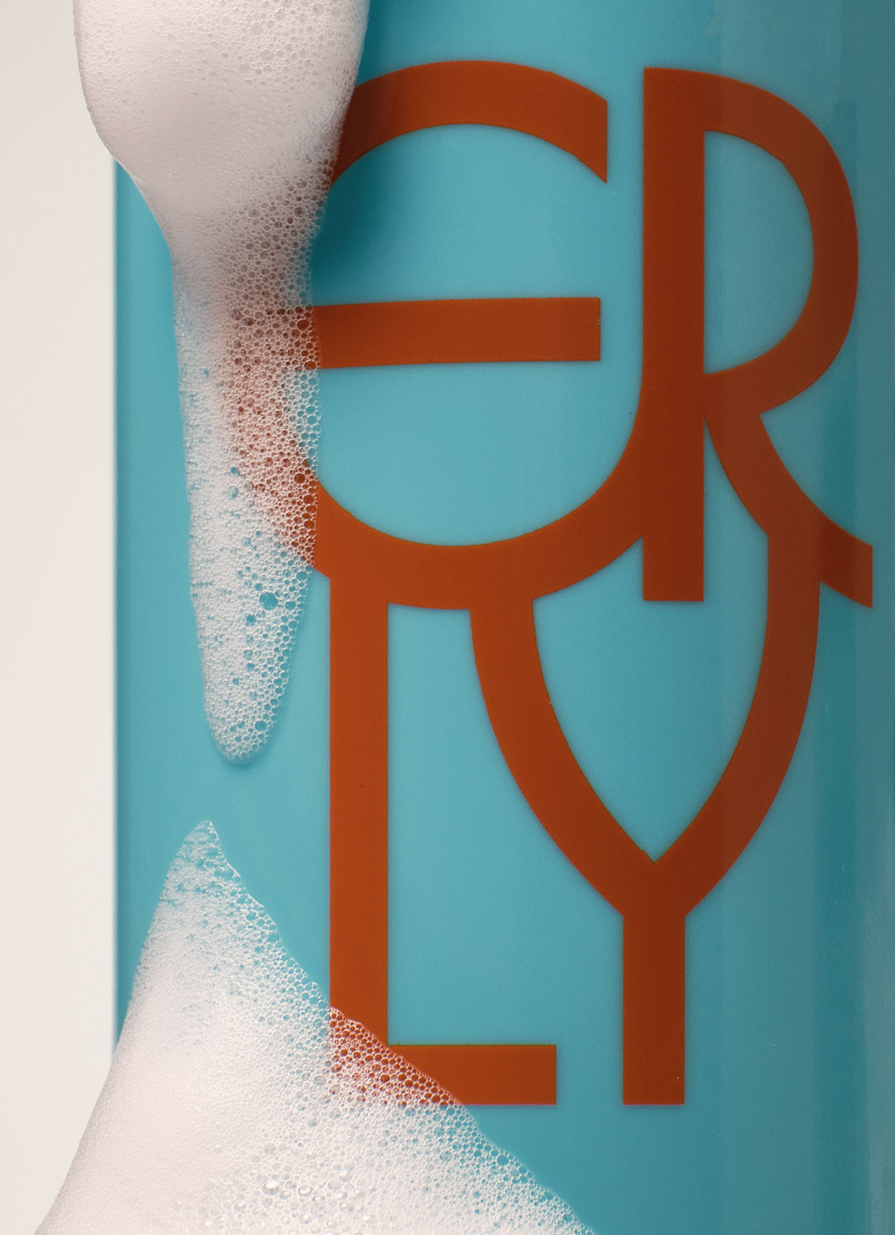
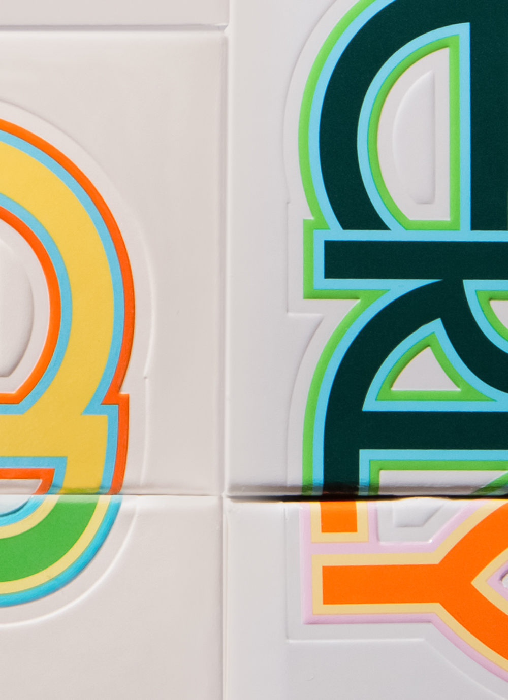
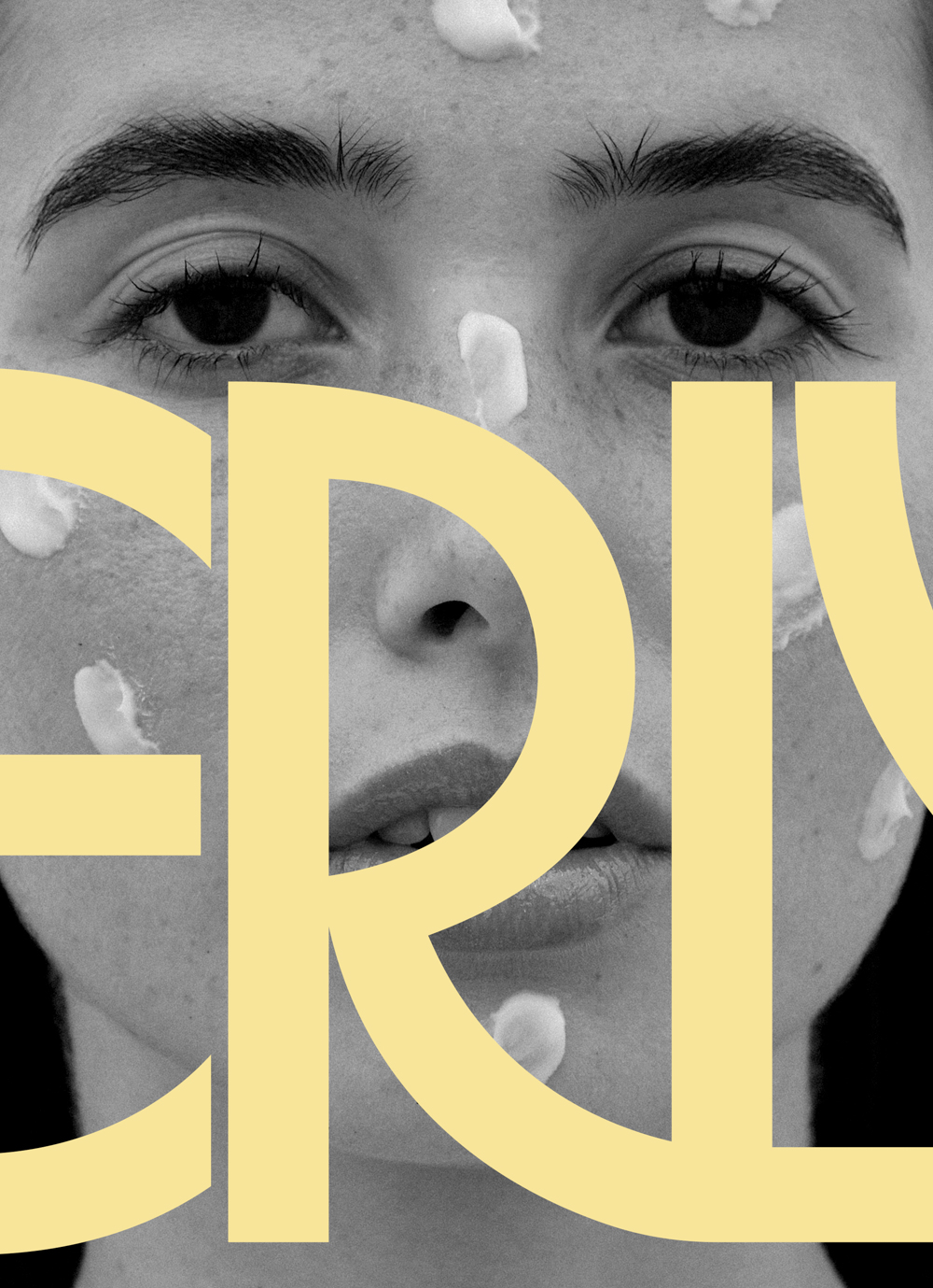
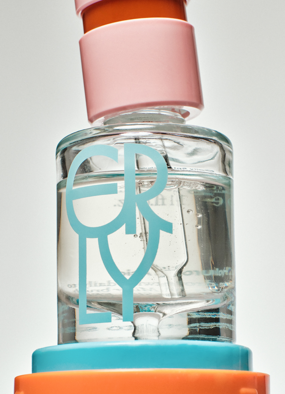
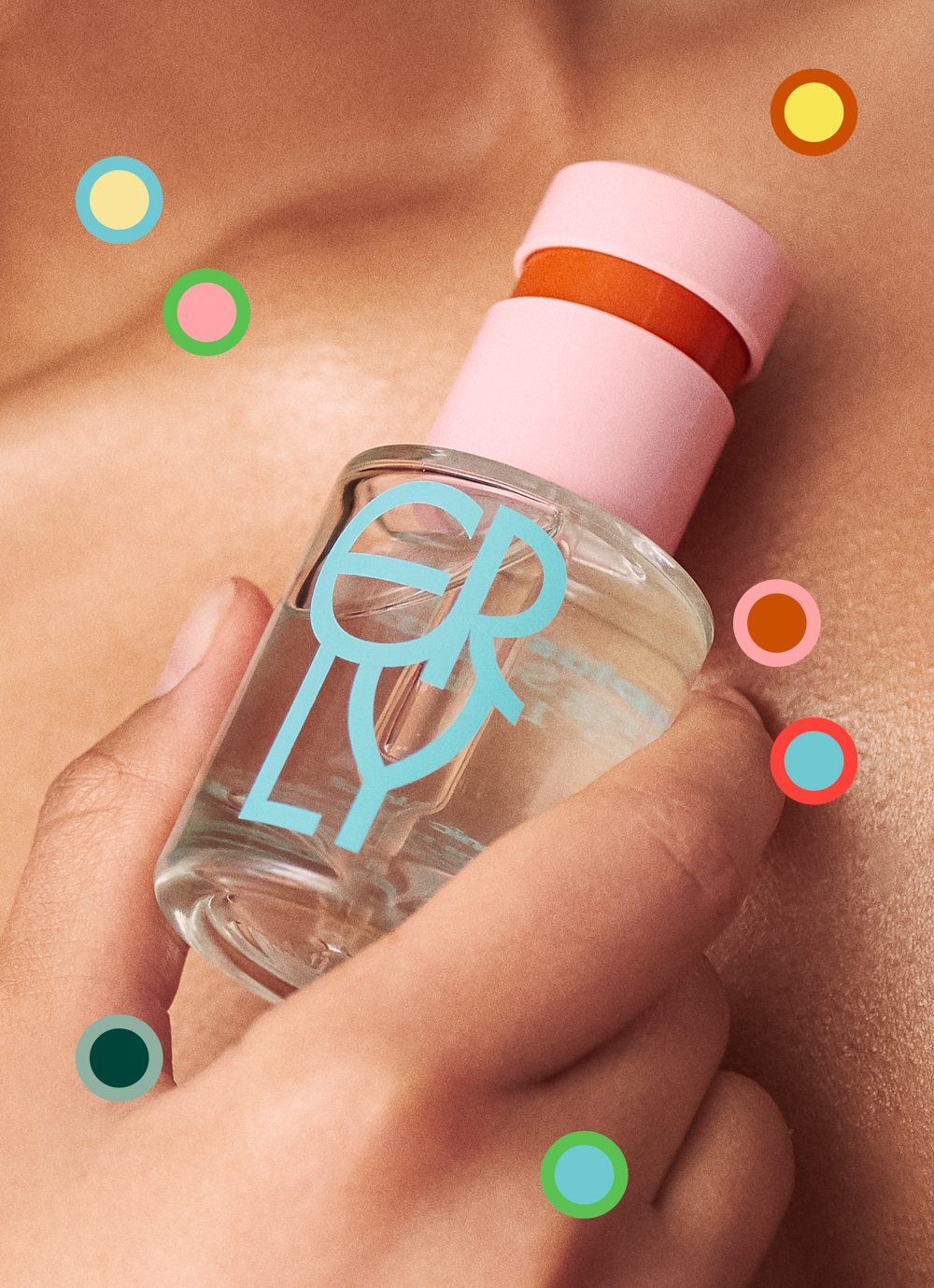
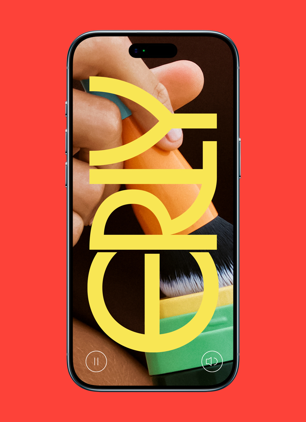
Erly’s visual identity builds around a strong wordmark inspired by the stirring motion of mixing serum drops into moisturizer: the letters melt into one, as in compounding. Typeset in Herbus by Eliott Grunewald, the logotype can be used in its simplified form, or surrounded by 2 outer layers for an additional burst of color. The stacked and horizontal versions of the logotype create versatility across implementations, allowing it to scale to any surface it’s on. A bold use of color instills energy into the identity and makes printed implementations stand out, while carefully considered print finishes elevate the brand as a whole.