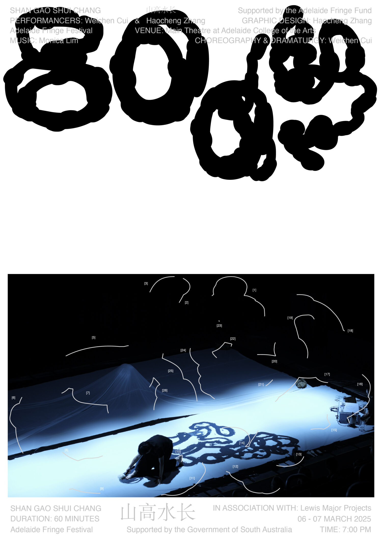
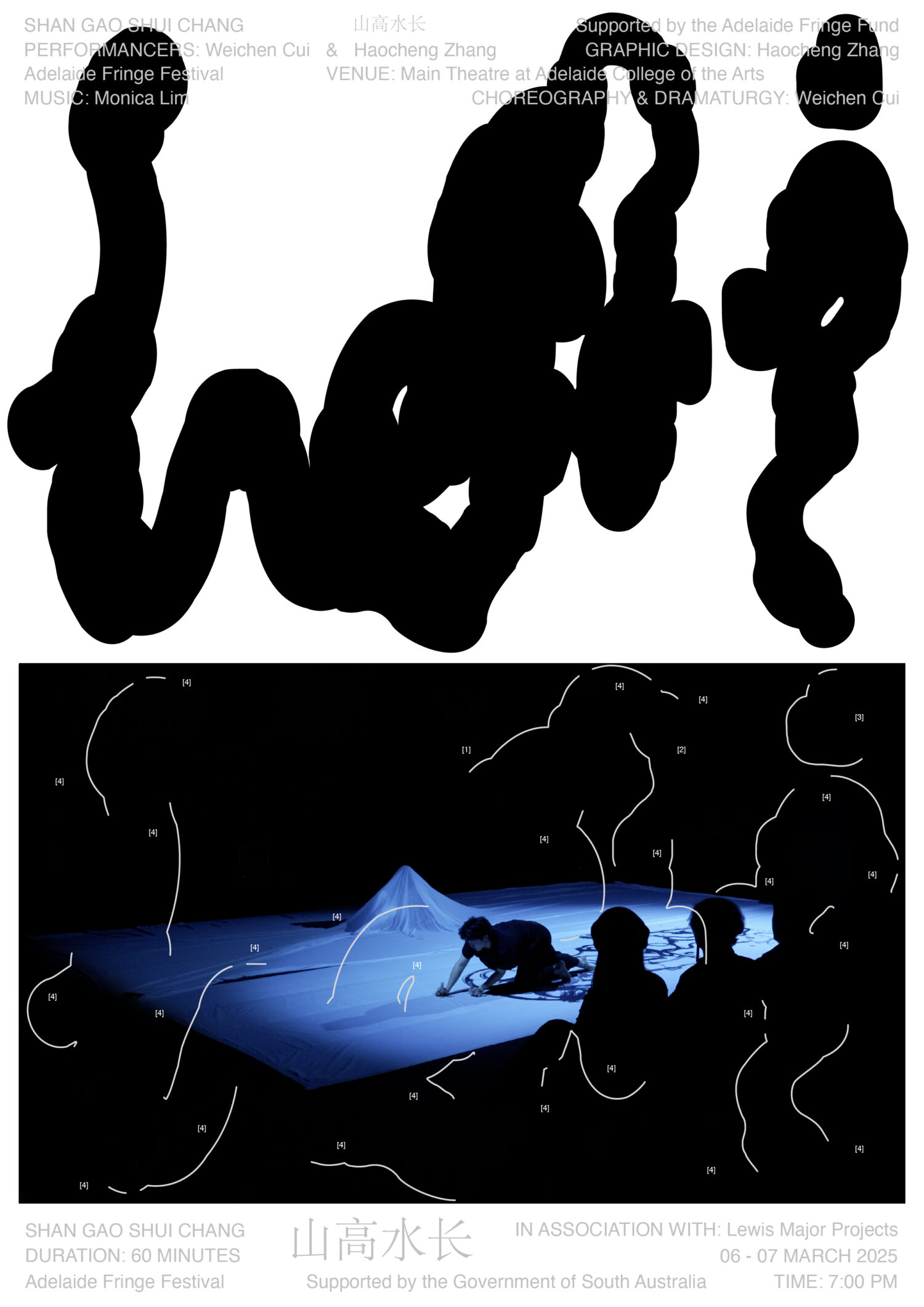
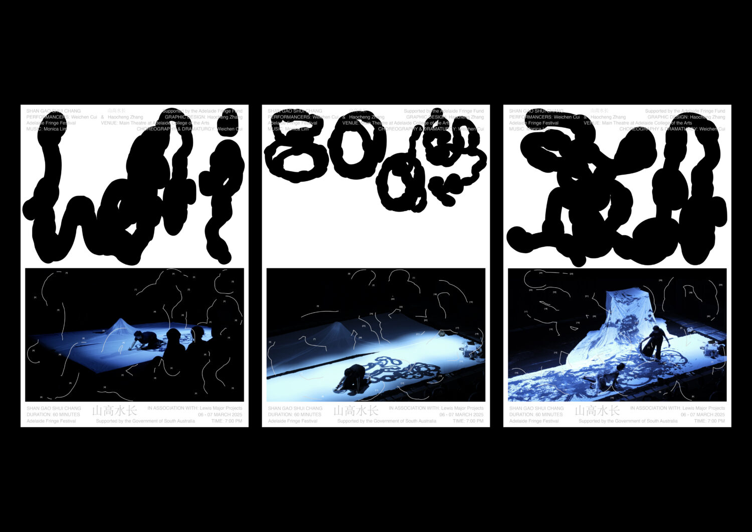
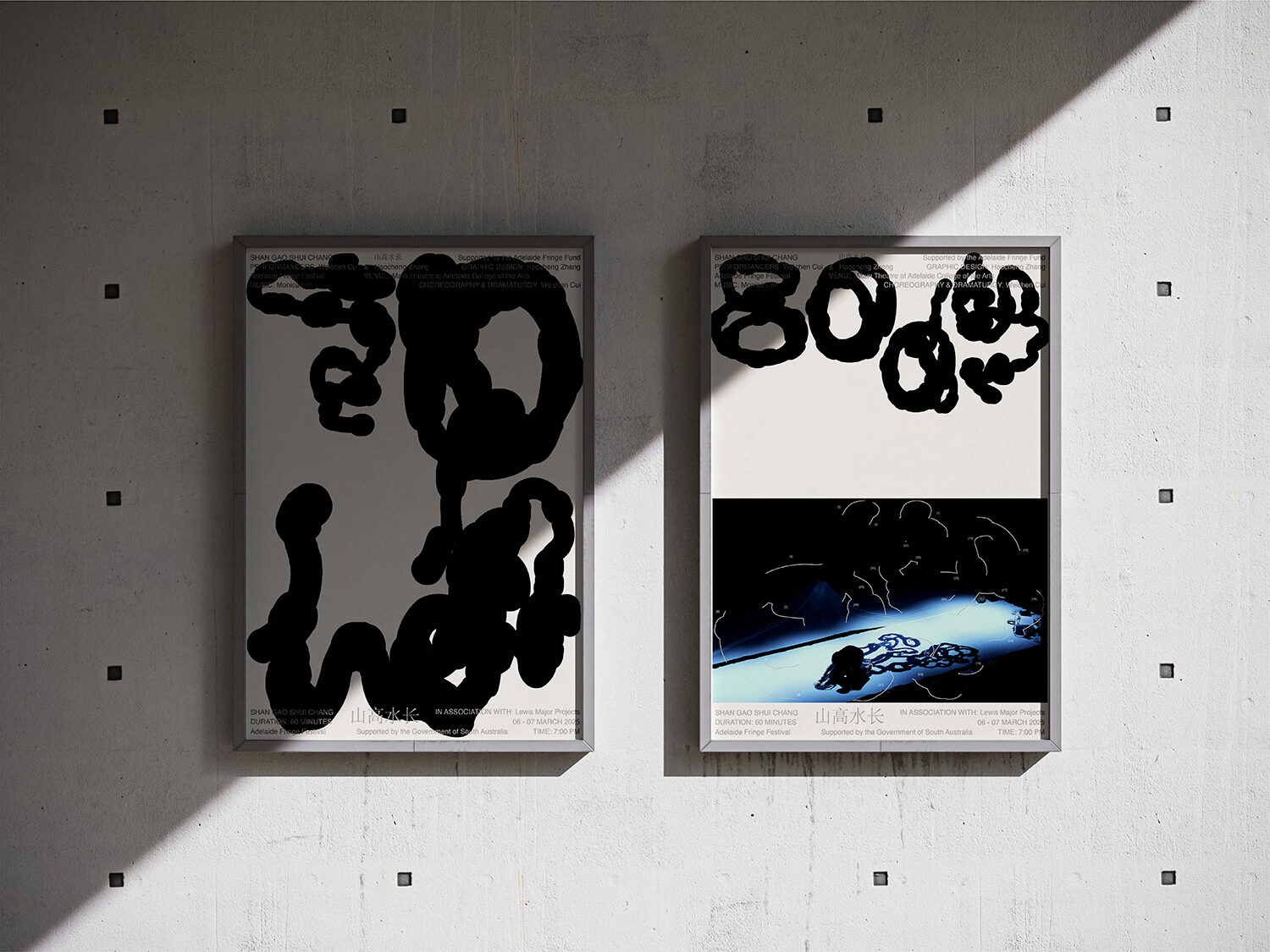
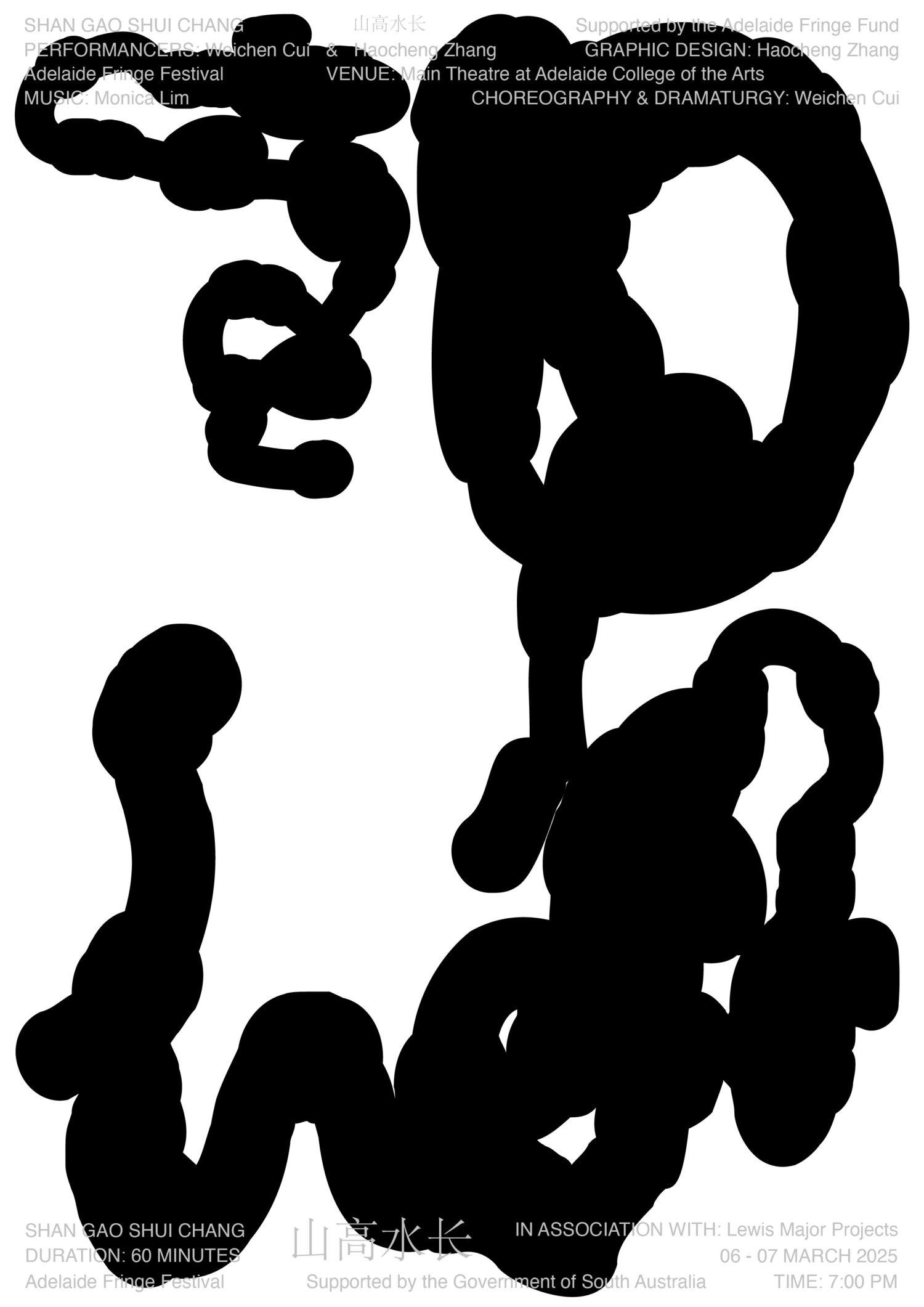
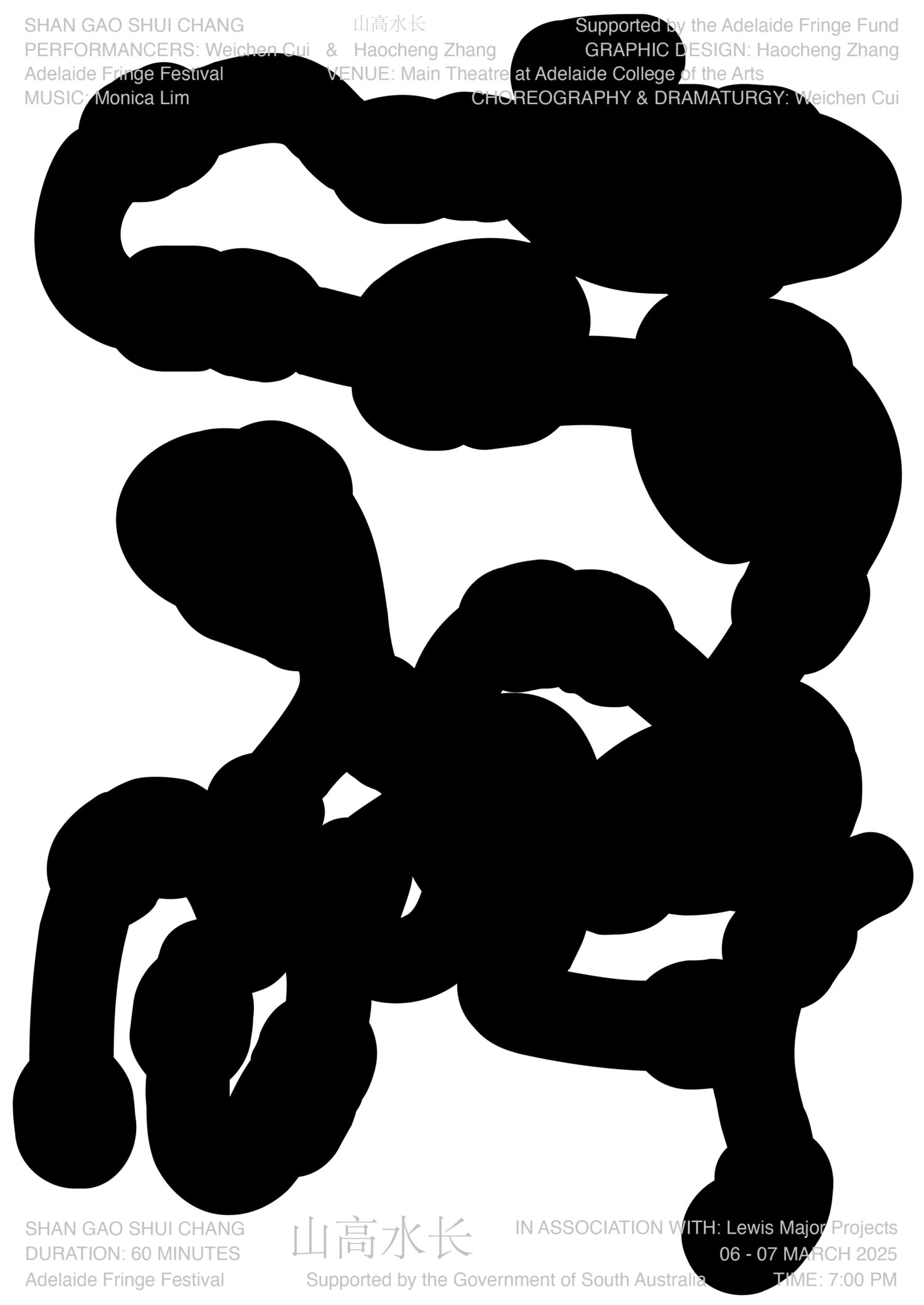
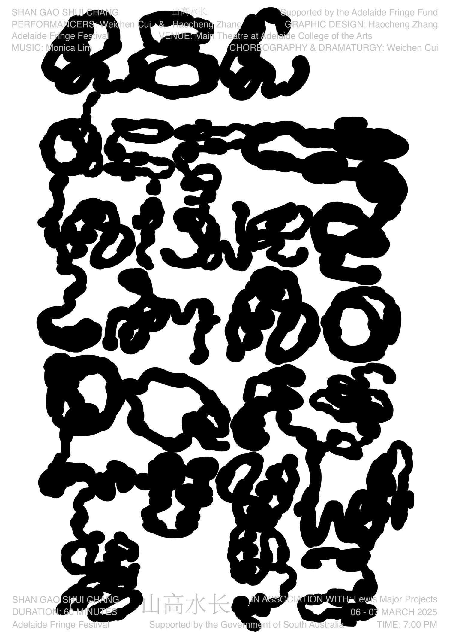
This poster series for the Adelaide premiere of Shan Gao Shui Chang 山高水长 translates choreographic movements into a typeface. Rooted in embodied calligraphy, the design explores movement as visual language, creating a typographic system that documents, communicates, and extends the performance through experimental graphic design.
Haocheng Zhang
Adelaide Fringe – Poster Design for 山高水长 (Shan Gao Shui Chang) Performance
- Awarded
- Culture
- Typography
Project Summary
Project Information
Shan Gao Shui Chang 山高水长 is an interdisciplinary performance integrating choreography, sound, and visual art. Staged at the Main Theatre of the Adelaide College of the Arts and supported by the South Australian Government and Adelaide Fringe Fund, the project explores how movement can shape visual language. As both performer and designer, I created a poster series that doesn’t merely promote the event but acts as a visual extension of its embodied logic.
I designed an experimental typeface inspired by body calligraphy, forms derived from choreographic gestures and symbolic movement sequences. These glyphs are not decorative; they archive the performance’s kinaesthetic intelligence, forming a bridge between bodily expression and typographic form.
This was a self-initiated project, and the posters became a site of graphic experimentation where calligraphy, dance, and design coalesce. The series not only reflects the performance but actively participates in it, dissolving the divide between documentation and live art. Typography, in this context, becomes movement captured in still form, an archive of the body’s ephemeral movement.
This approach redefines the poster as more than communication, it’s a sensory extension of the event, shaped by the same movement, rhythms, and philosophies that informed the live work. It is not design for performance; it is design as performance.
Credits
Haocheng Zhang, Graphic Designer, Type Designer
Weichen Cui, Choreography & Dramaturgy
Haocheng Zhang & Weichen Cui, Performancers
Monica Lim, Sound Design