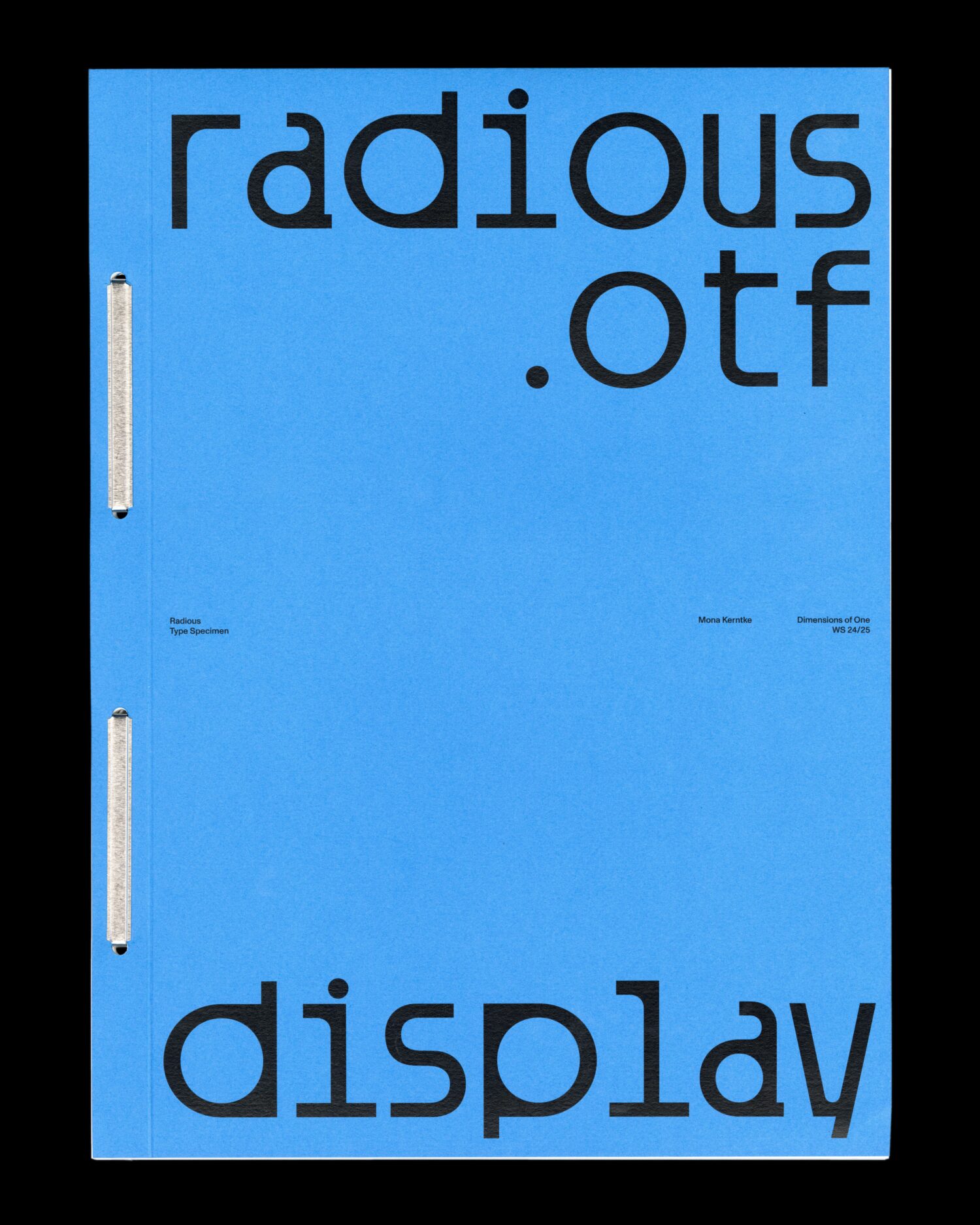
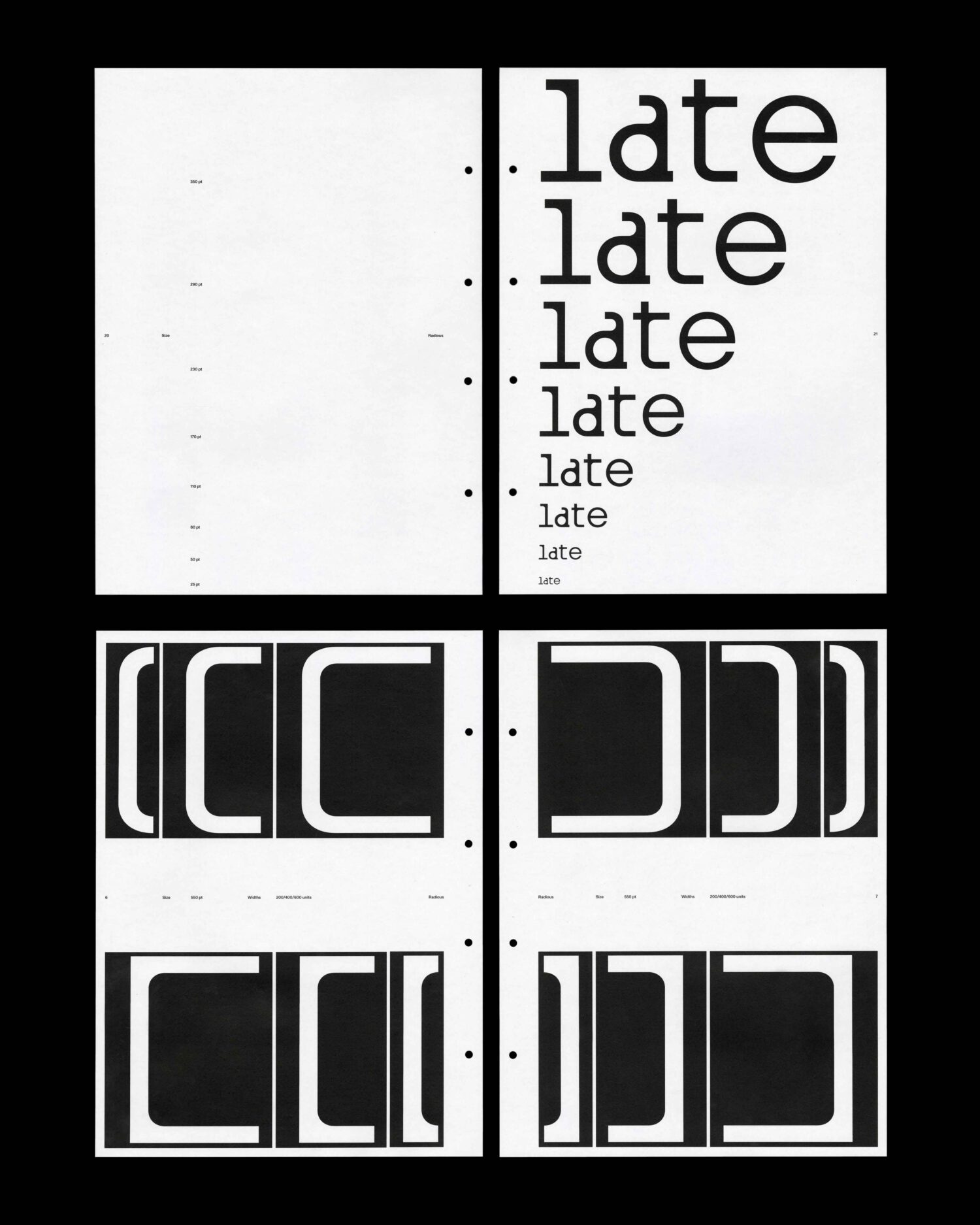
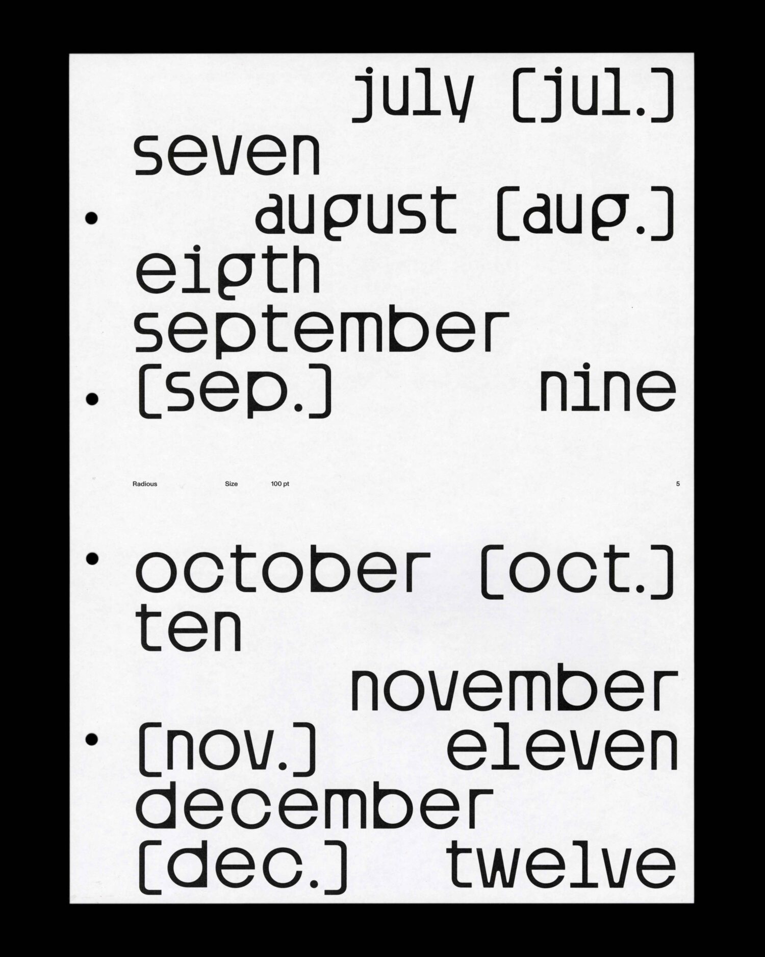
Radious began as an in-depth exploration of monospaced fonts, examining their structure and unique character. Through experiments with geometric shapes, proportions, and the interplay of black value, Radious slowly took shape.
Project Summary
Project Information
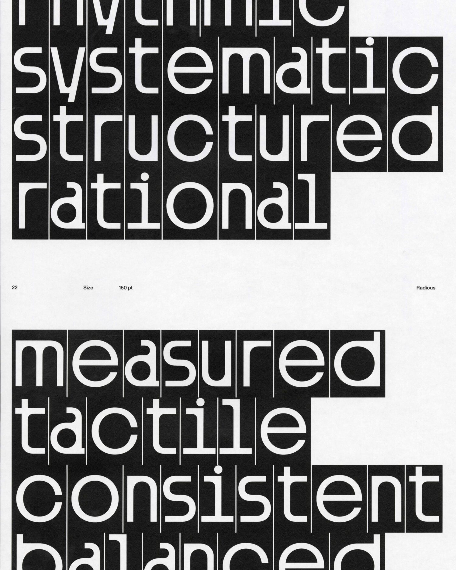
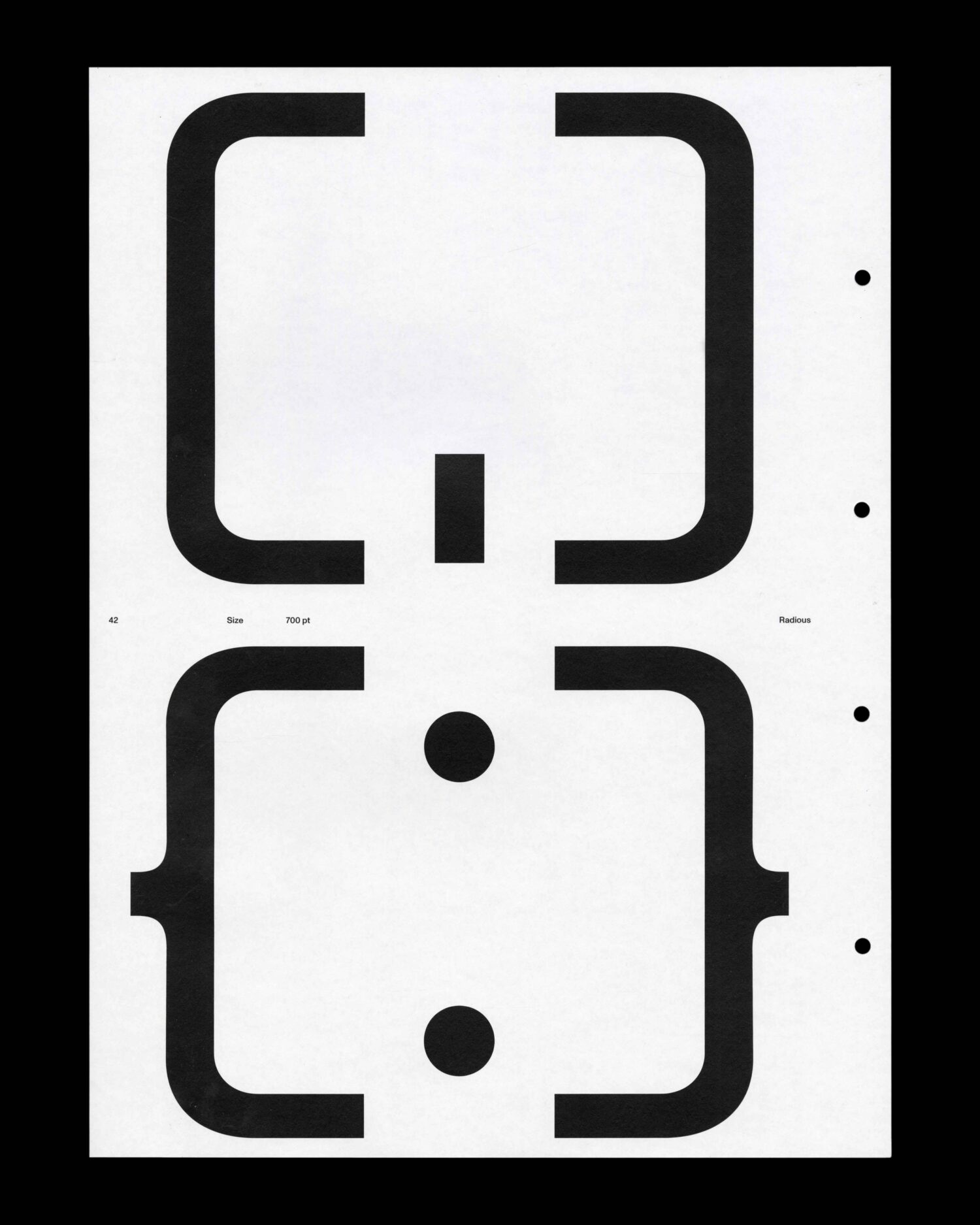
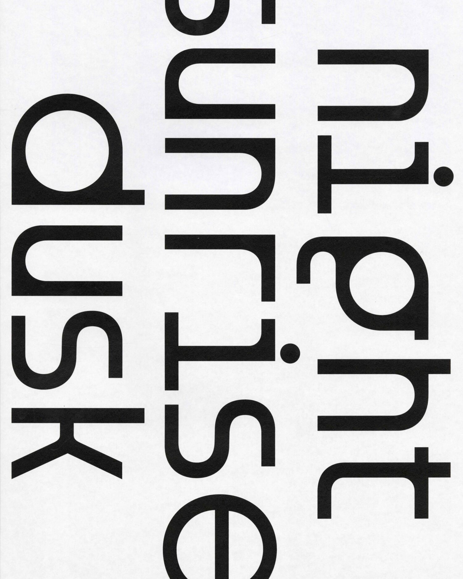
Radious breaks free from the monotony of monospaced fonts by introducing a proportional system and playful variations in character widths. The design blends geometric precision with a dynamic aesthetic, combining sharp edges with soft curves. The result is a tension between black value and cluster density, creating a rhythm and texture that feel both structured and alive.
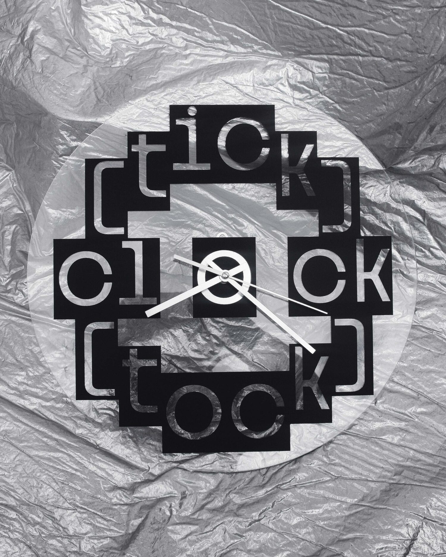
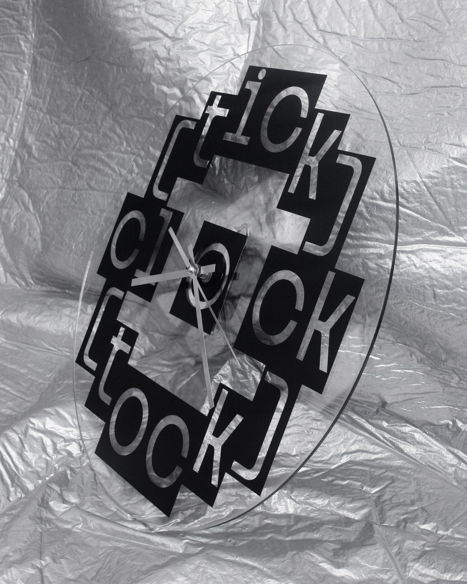
Just as time is divided into consistent units, Radious is based on a precise proportional system. To emphasize this metronomic quality that perfectly aligns with the concept of the typeface, I used the textual elements “tick” and “tock” – the sound imitations of a clock – rather than numbers to indicate the time. The clock face reflects the playful approach of Radious and showcases a creative application of the typeface.
Credits
Mona Kerntke, Design & Concept
Marcel Saidov, Supervision at Bauhaus University Weimar
Buch- und Kunstdruckerei Keßler, Printer